Industry: Retail
Role: Sr. User Experience Designer (with Accenture/Fjord)
Deliverables: : Heuristic & Data Analysis, User Journeys, Wireframes, Business Case for Design, Workflow Governance Model
MOBILE
REDESIGN
For a leading brick & mortar retailer
Challenge
I was hired by Fjord, a design agency owned by Accenture, as a Sr. Interaction Designer, to augment a team of staff designers and consultants on the redesign of Kohl’s omnichannel experience. Initially, I was assigned to the IOS mobile team. Later I led the design of the Android version of the app, designed new features for the mobile web experience, and developed a design process to manage workflows and approvals for the detailed design process.
I was fortunate to be embedded with a very capable team. Karin Little was the design director from Fjord on the project, and she labored tirelessly to keep all of the workstreams pointed in the right direction, and to ensure that the redesign across all platforms was coherent. Rachel Hinman, Mike Gadow, and Vikki Highland were the design leads for the IOS app, M.com, and Design Realization respectively, and did a great job setting the tone, keeping our teams focused, and managing a complex set of deliverables. And Erin Adelman, Danielle Bergman, and Sarah Genz, our project managers, made sure the whole machine ran on schedule and on budget.
My fellow designers Yachin You, Renee Anderson, Nick Totaro, Kelly Wengert, Amy Angerami, Zachary Eng worked very hard against unforgiving deadlines to come up with innovative new concepts, and a great deal of design detail that the client required in order to build the app.
Discovery
The team had started the engagement with a multi-day workshop, which yielded a series of customer journeys, personas, scenarios, pains and opportunities.
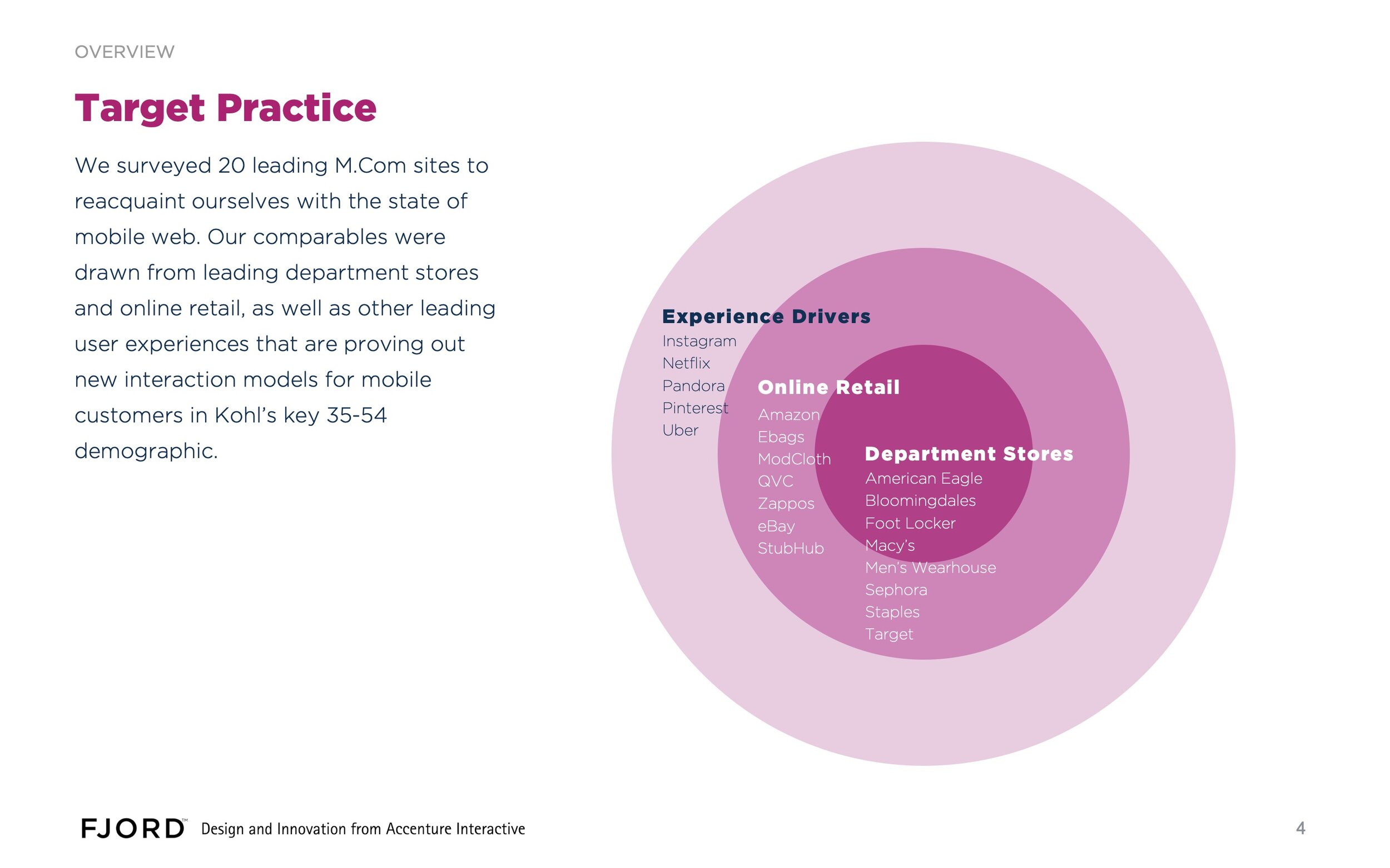
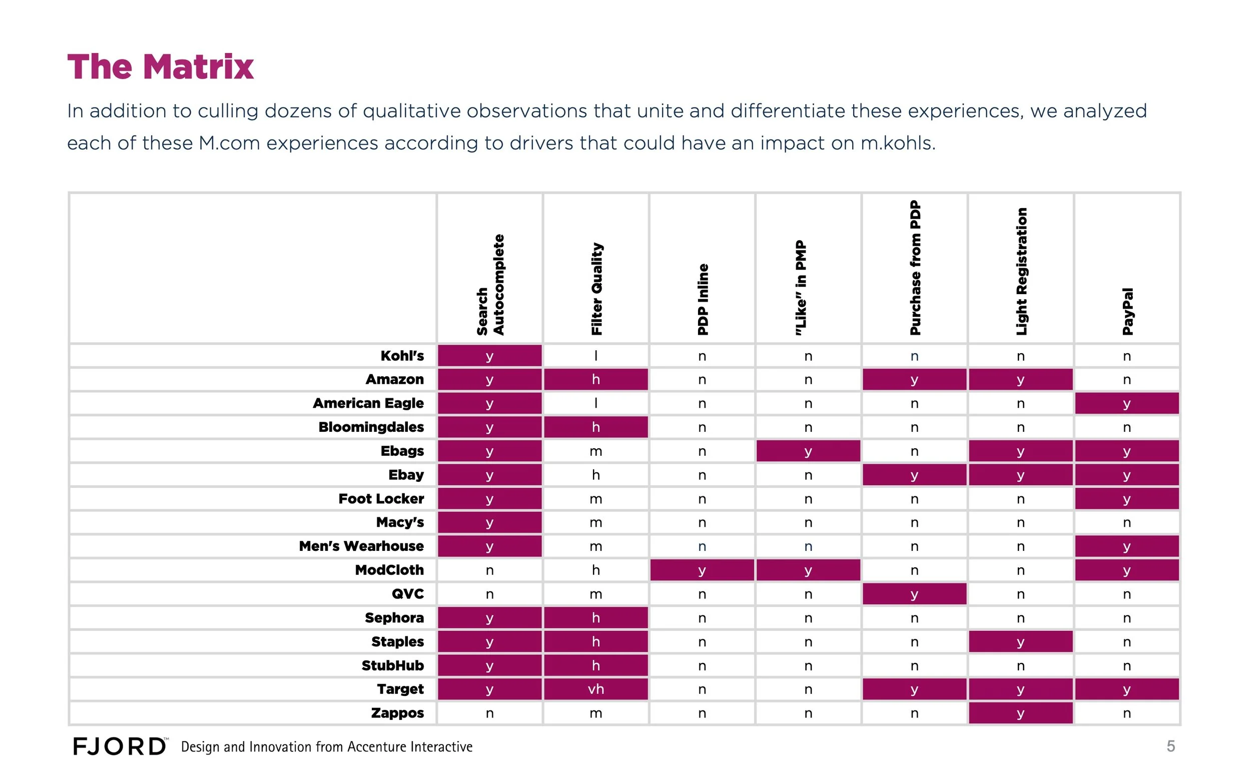
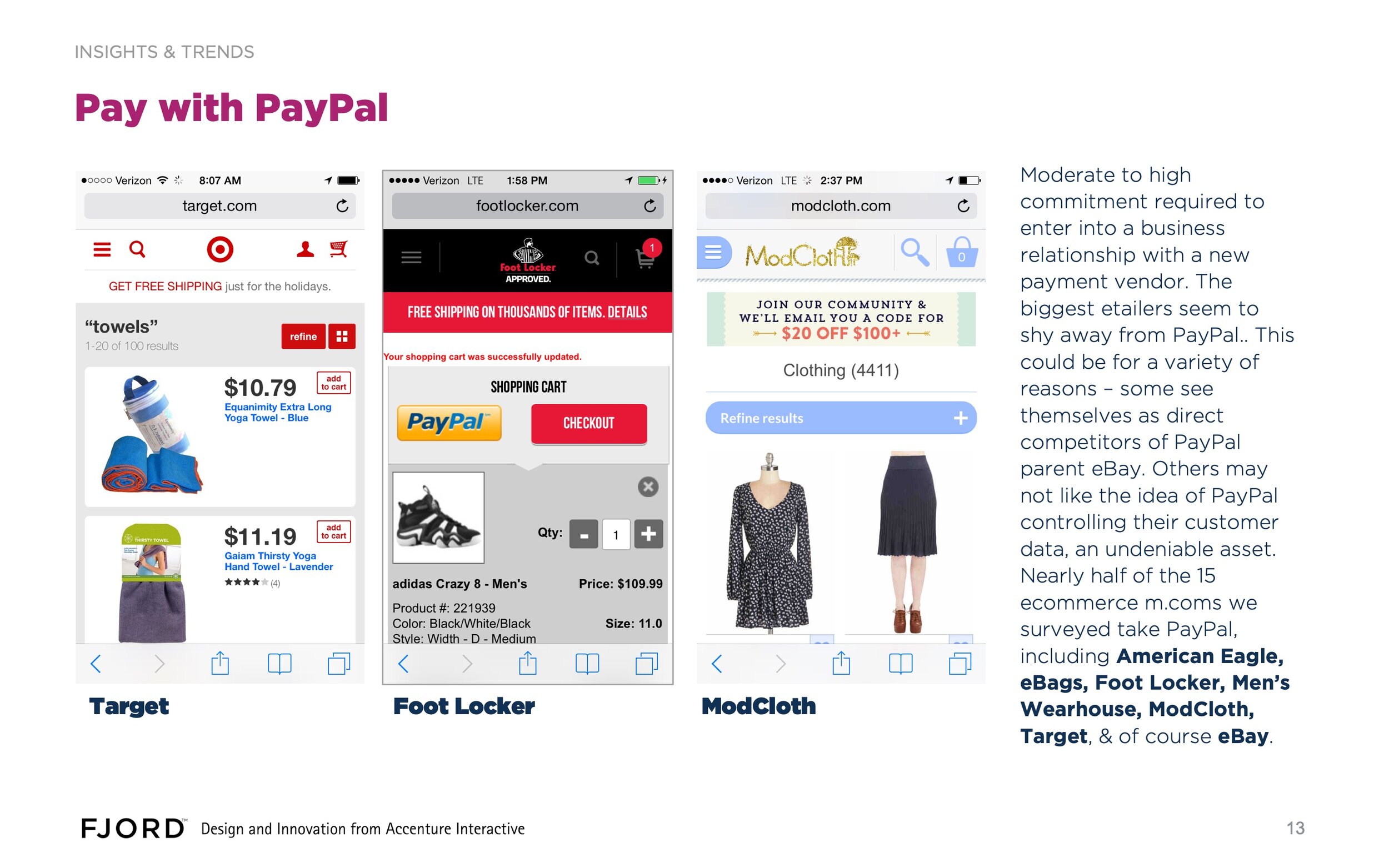
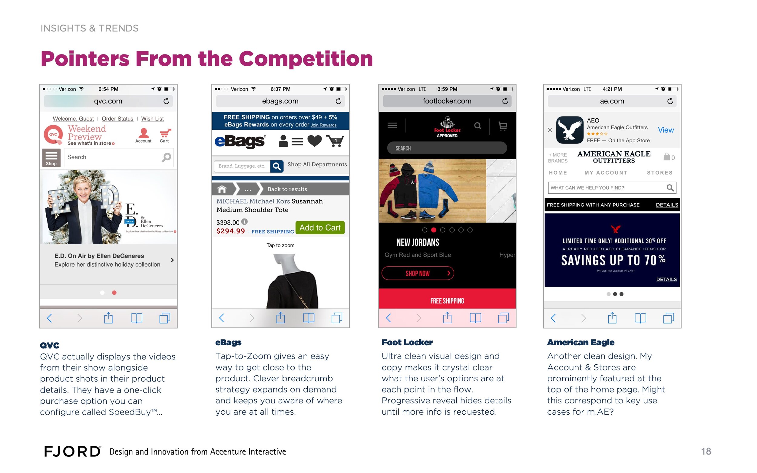
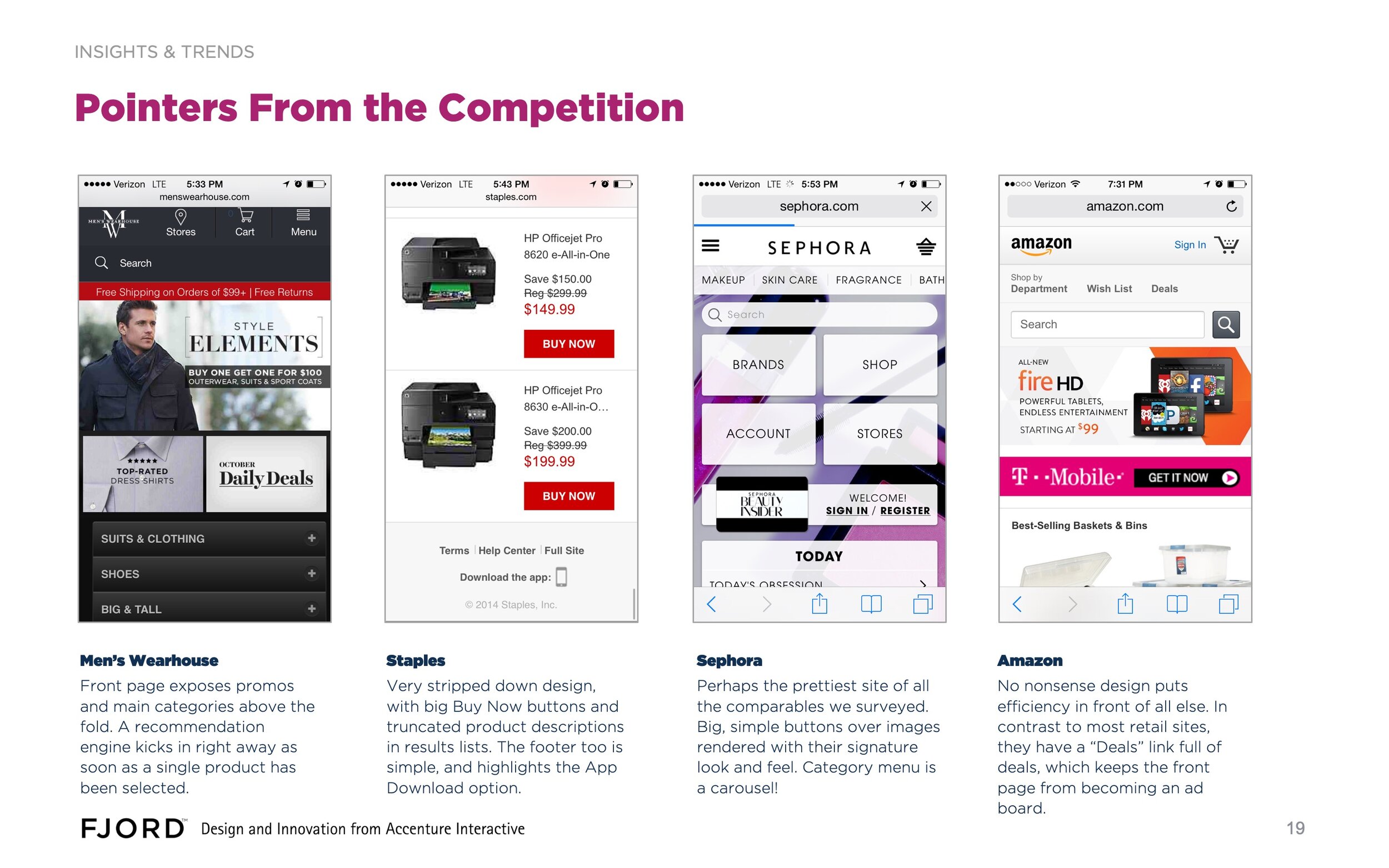
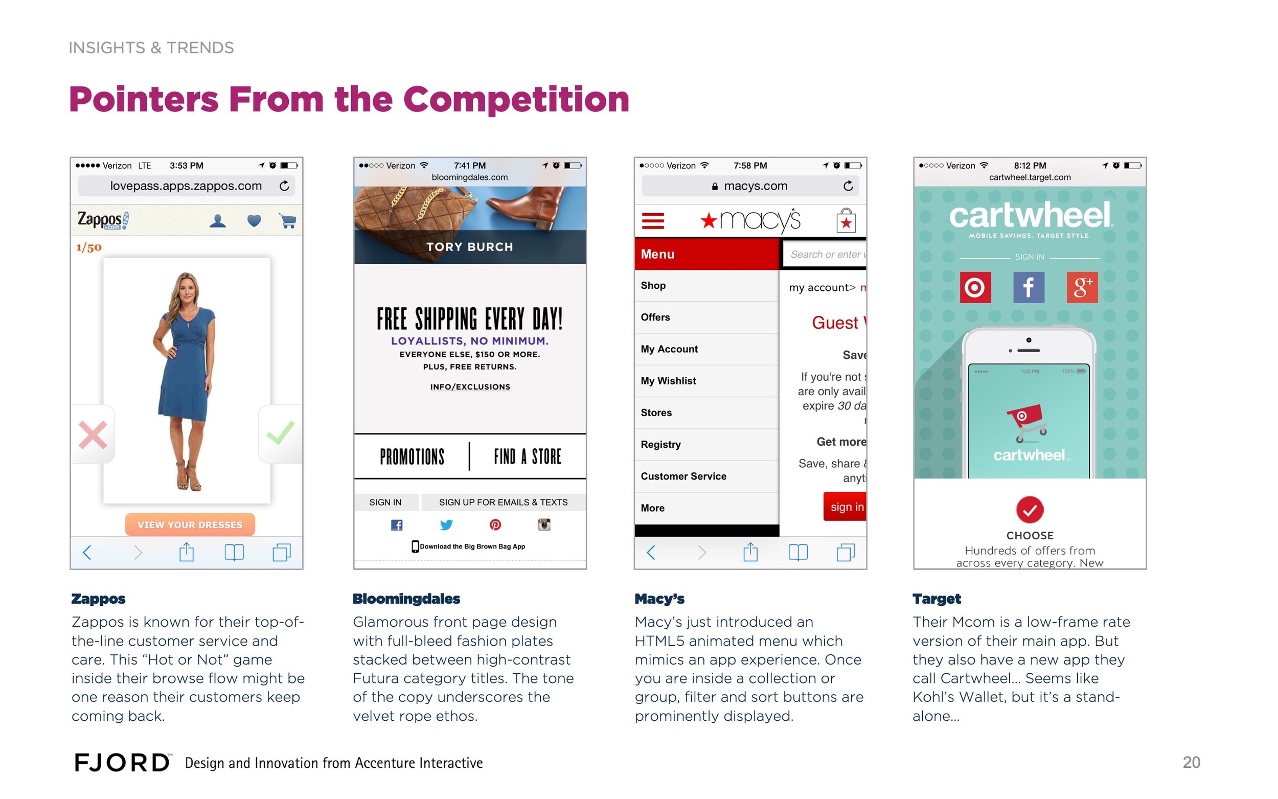
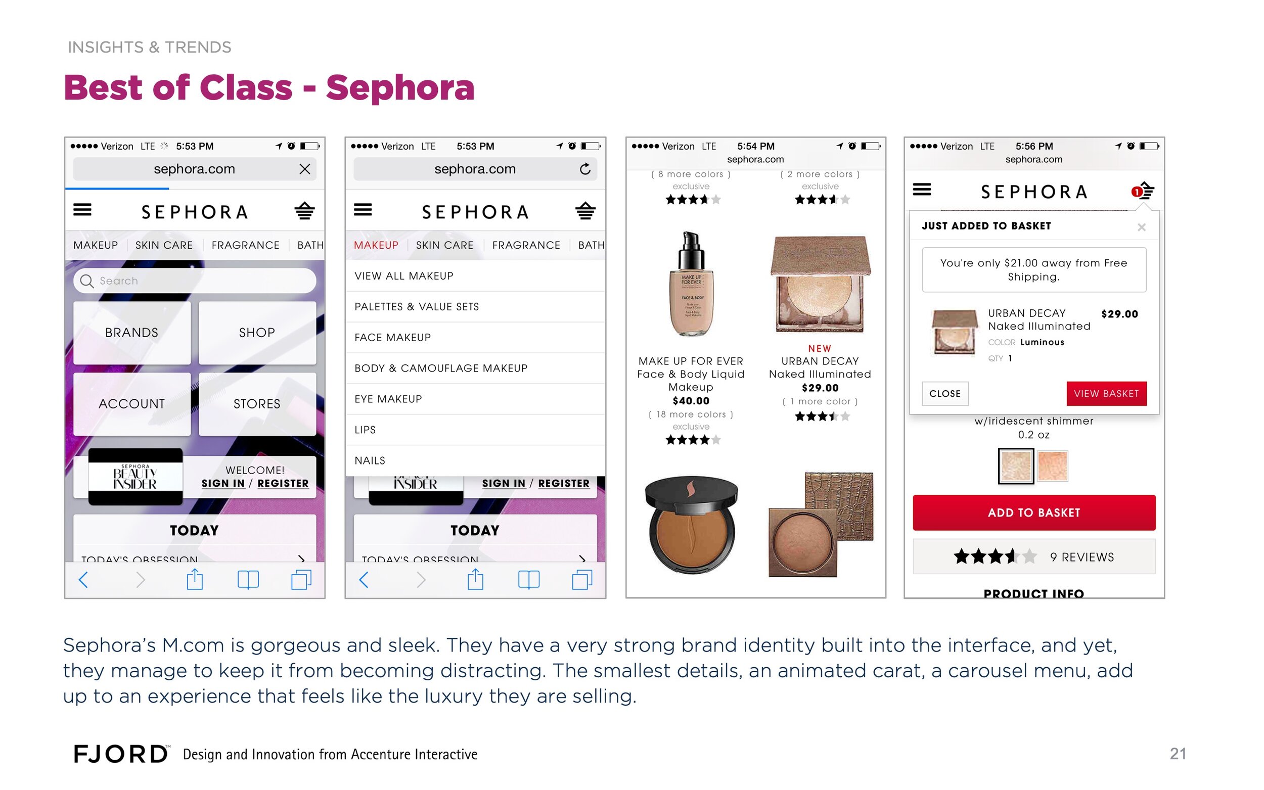
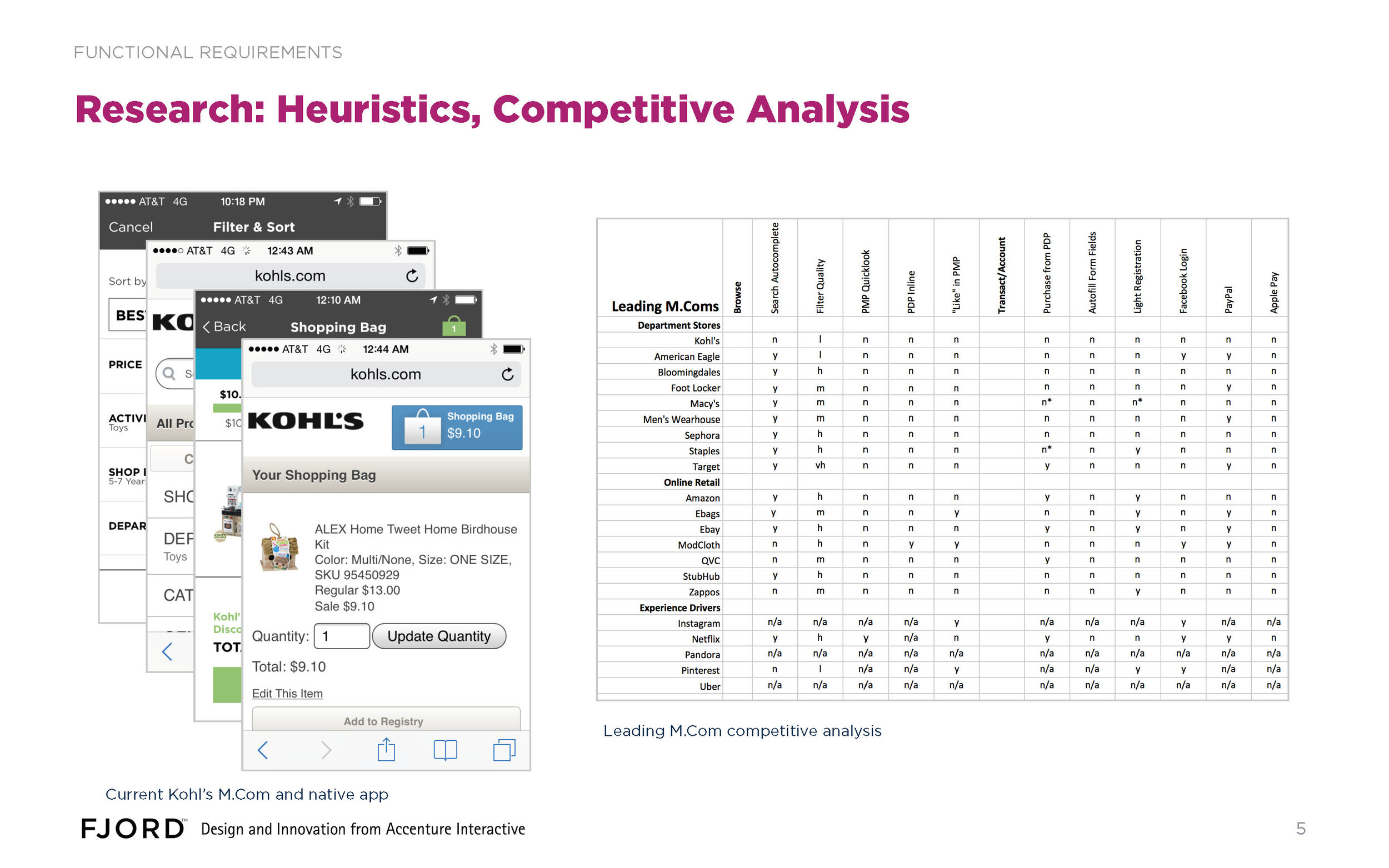
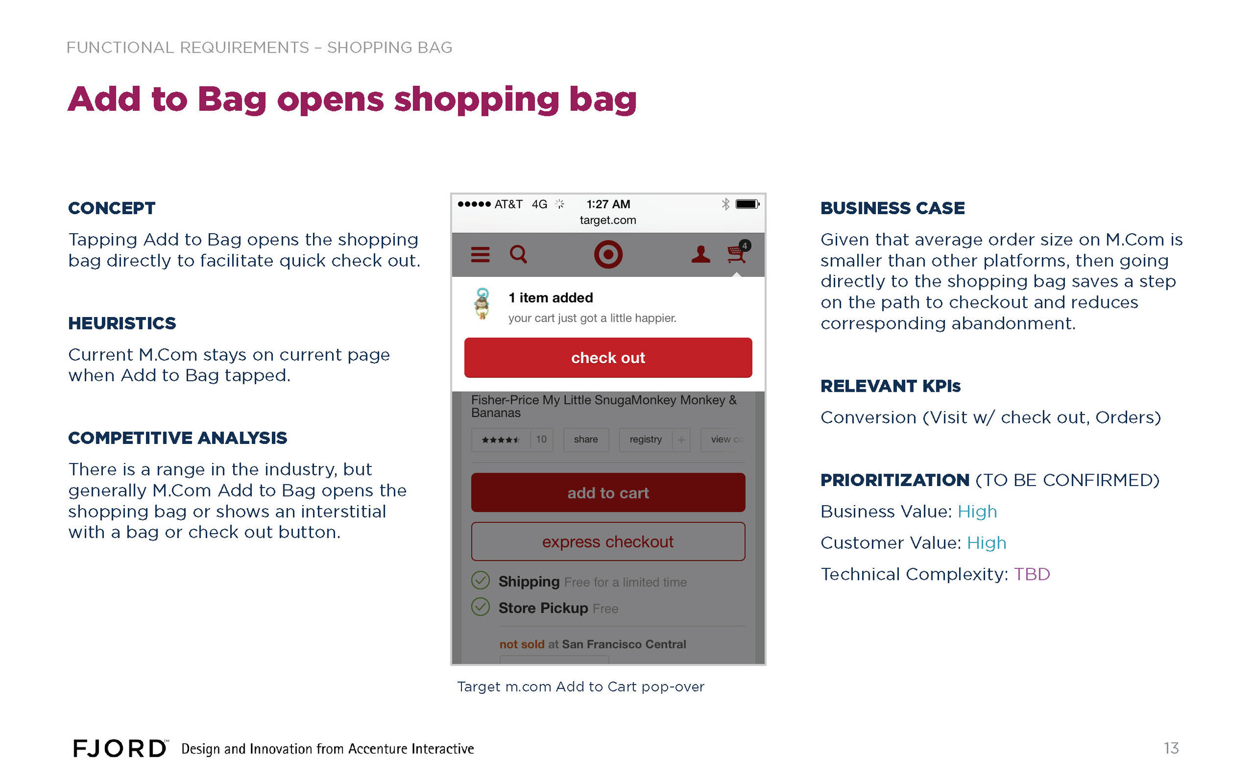
For mobile web, I did some heuristic analysis of competitor experiences.
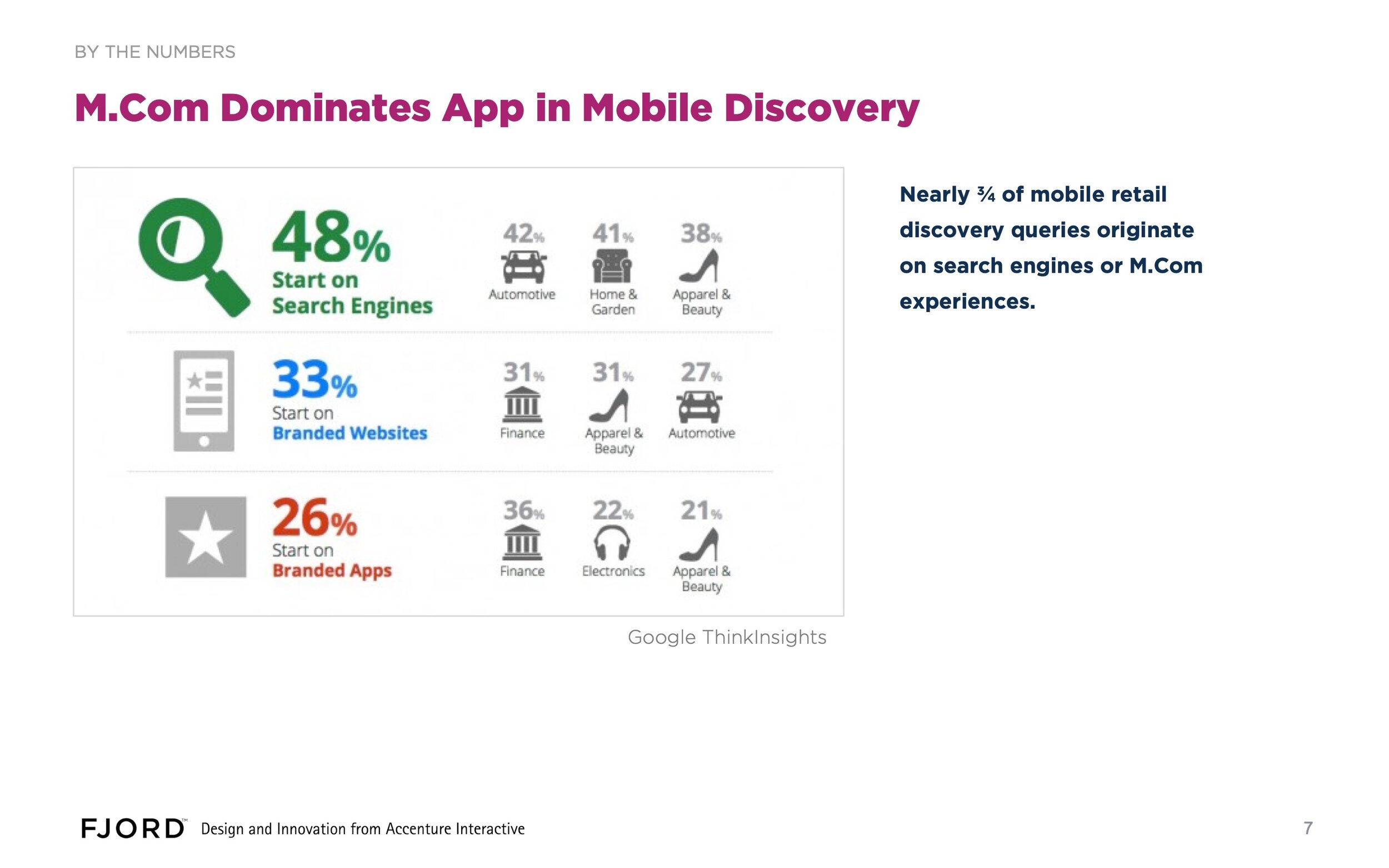
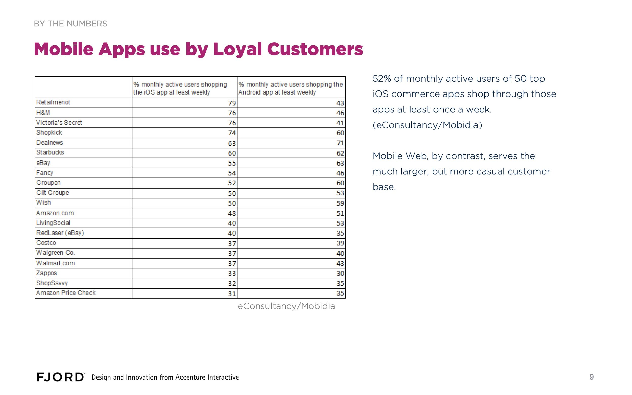
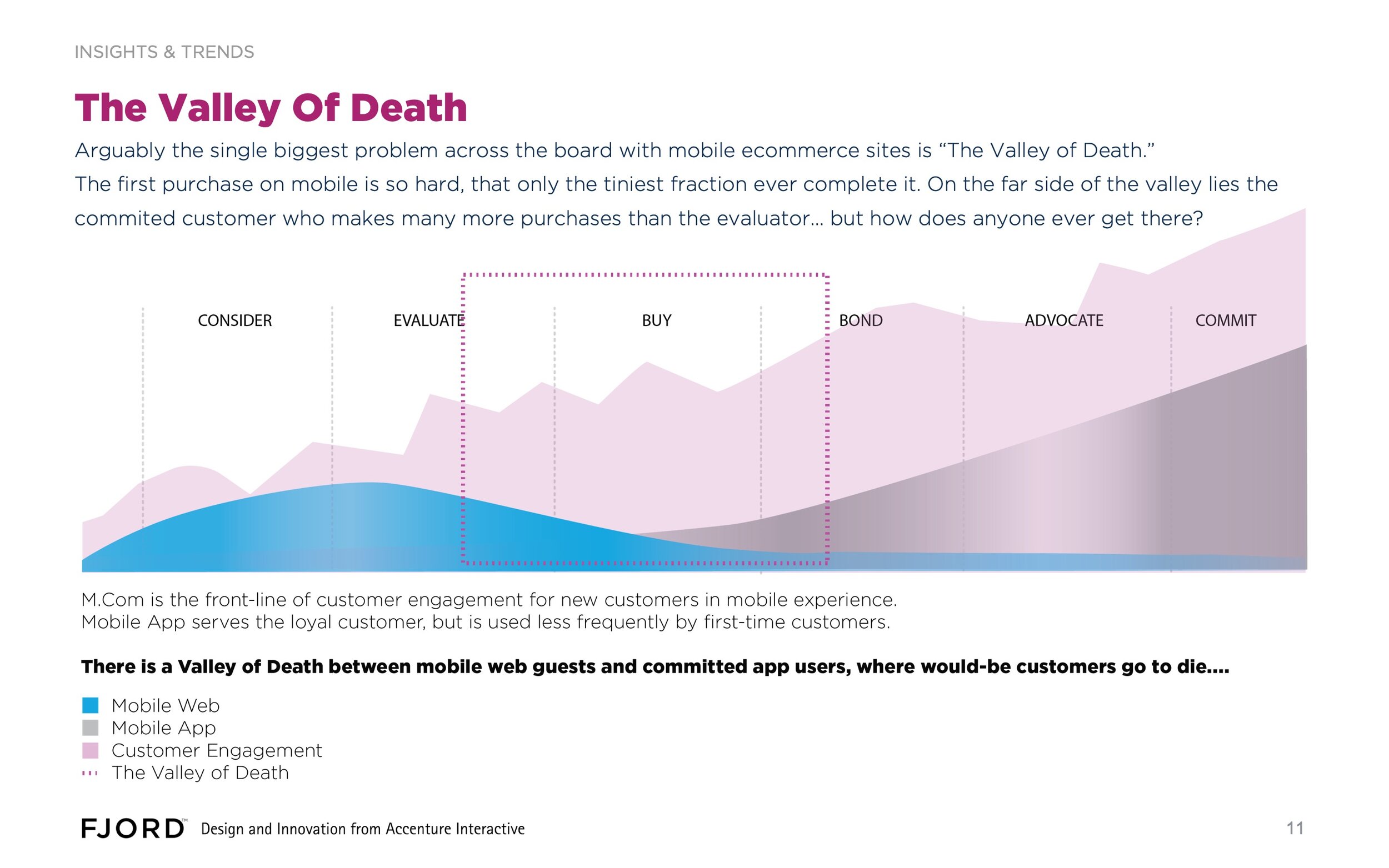
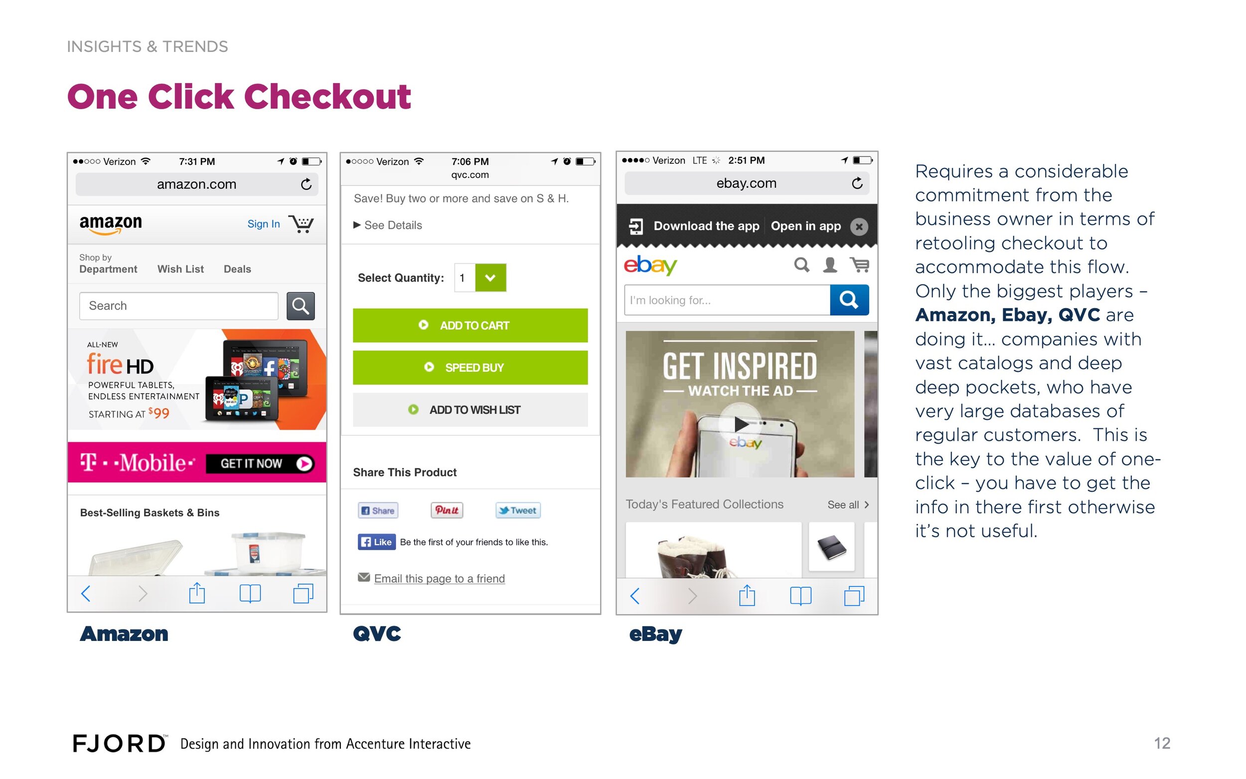
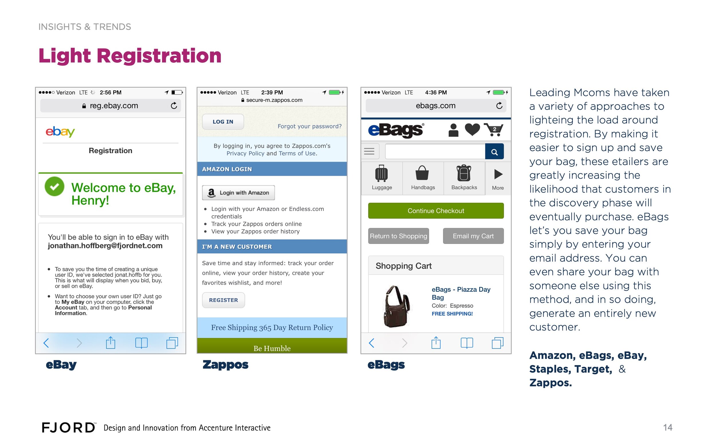
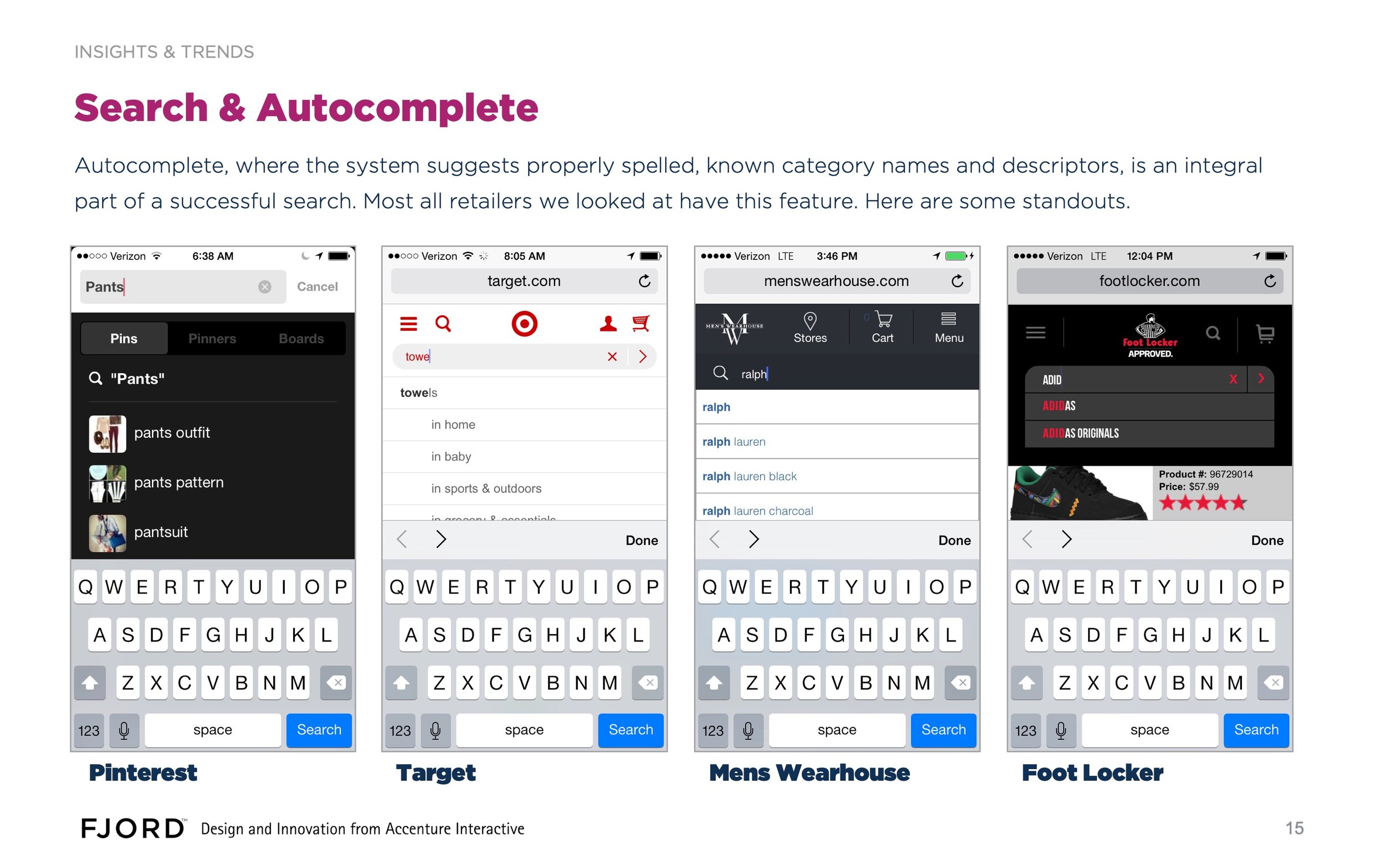
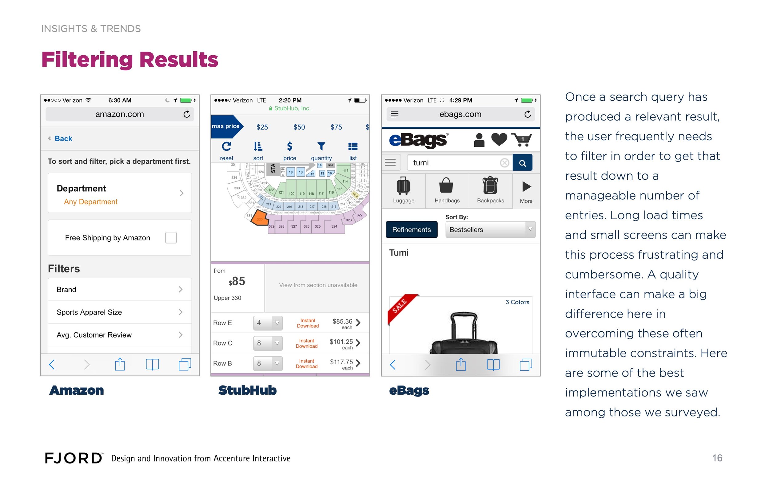
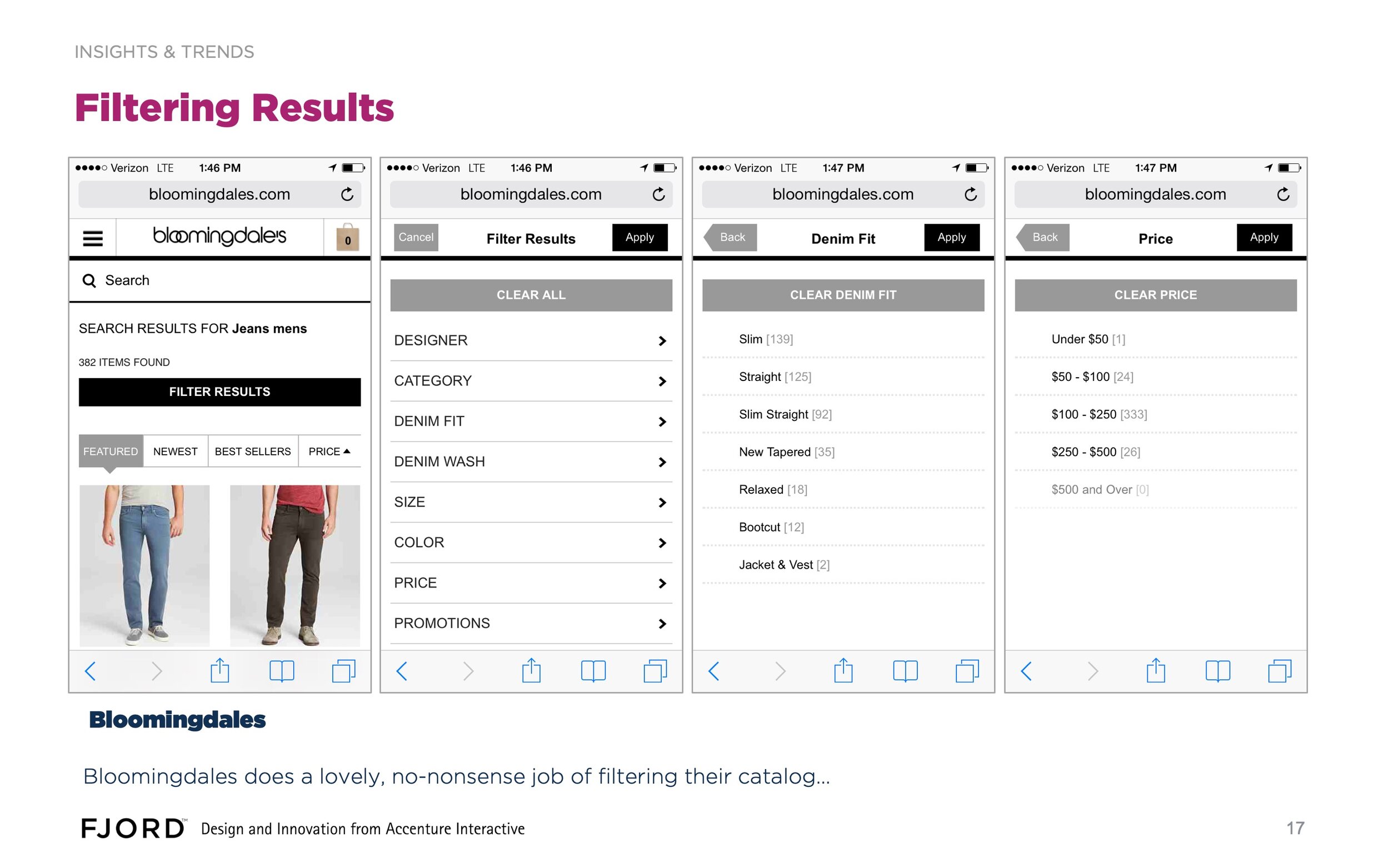
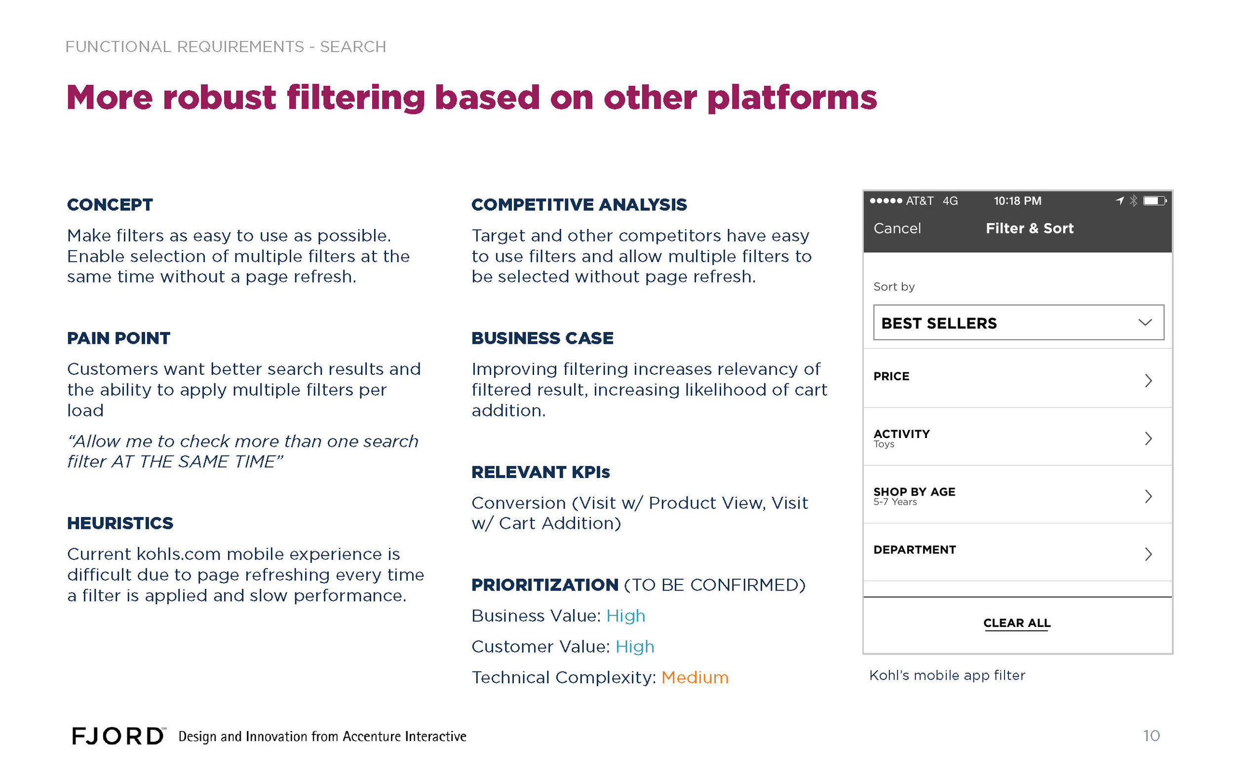
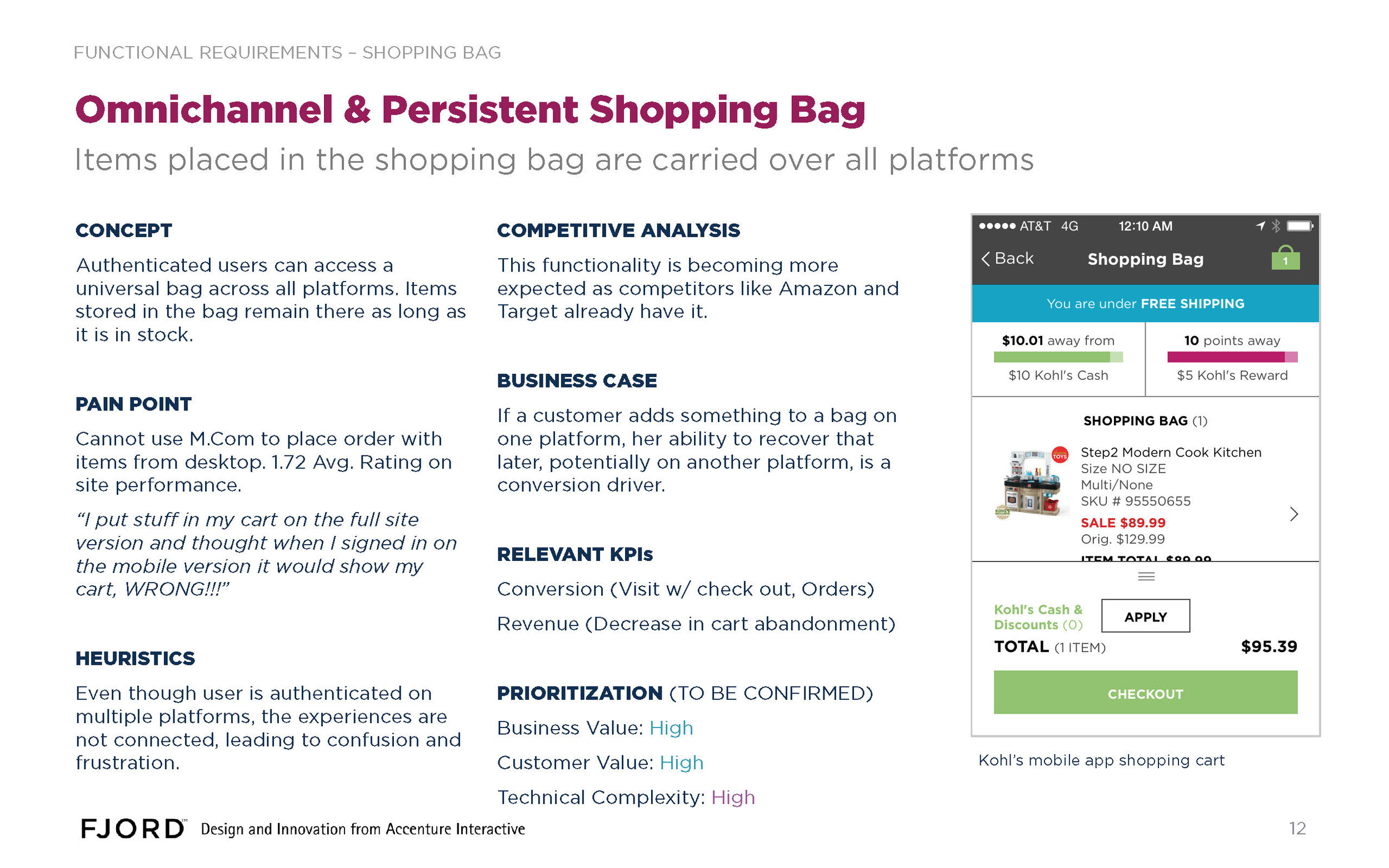
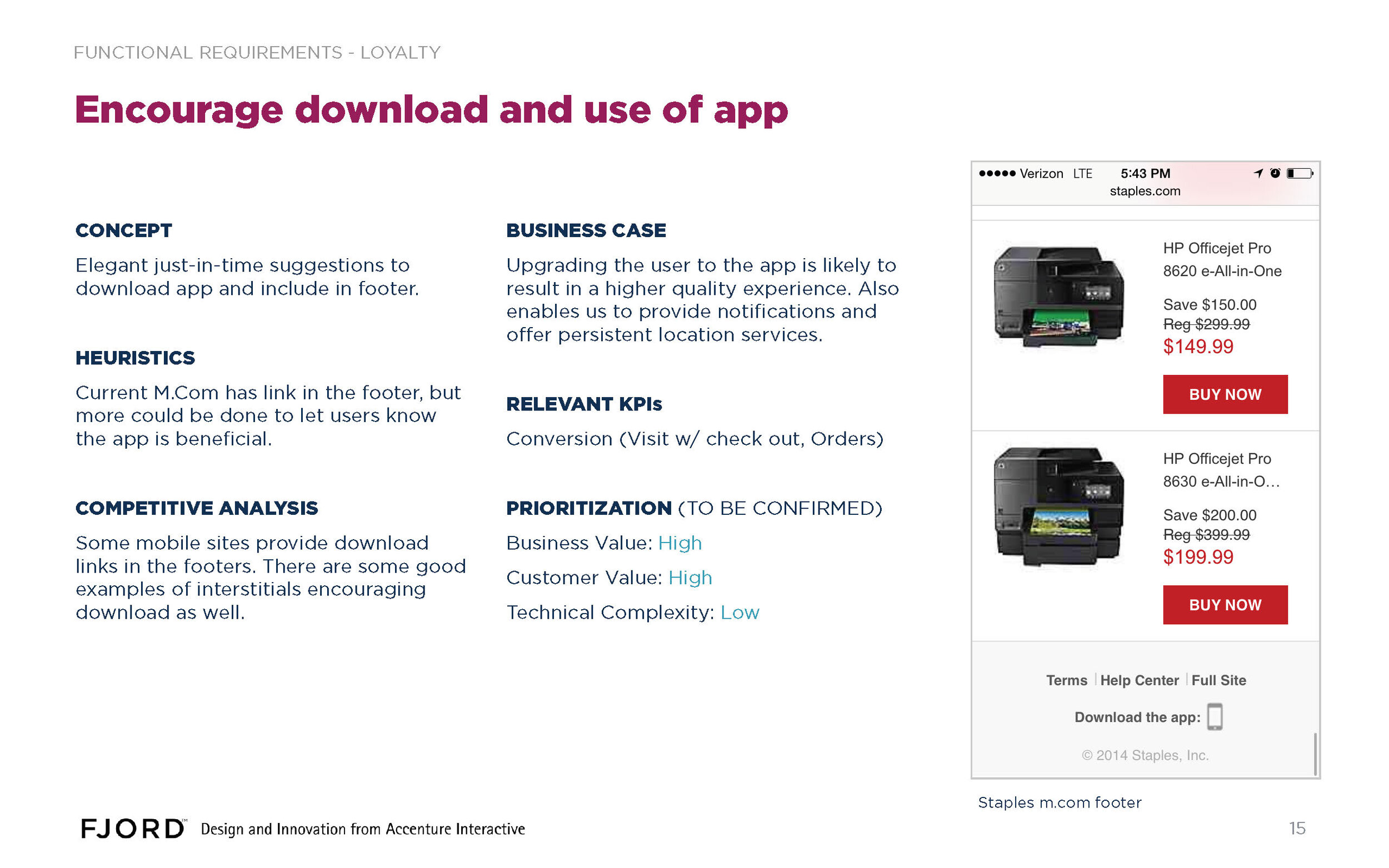
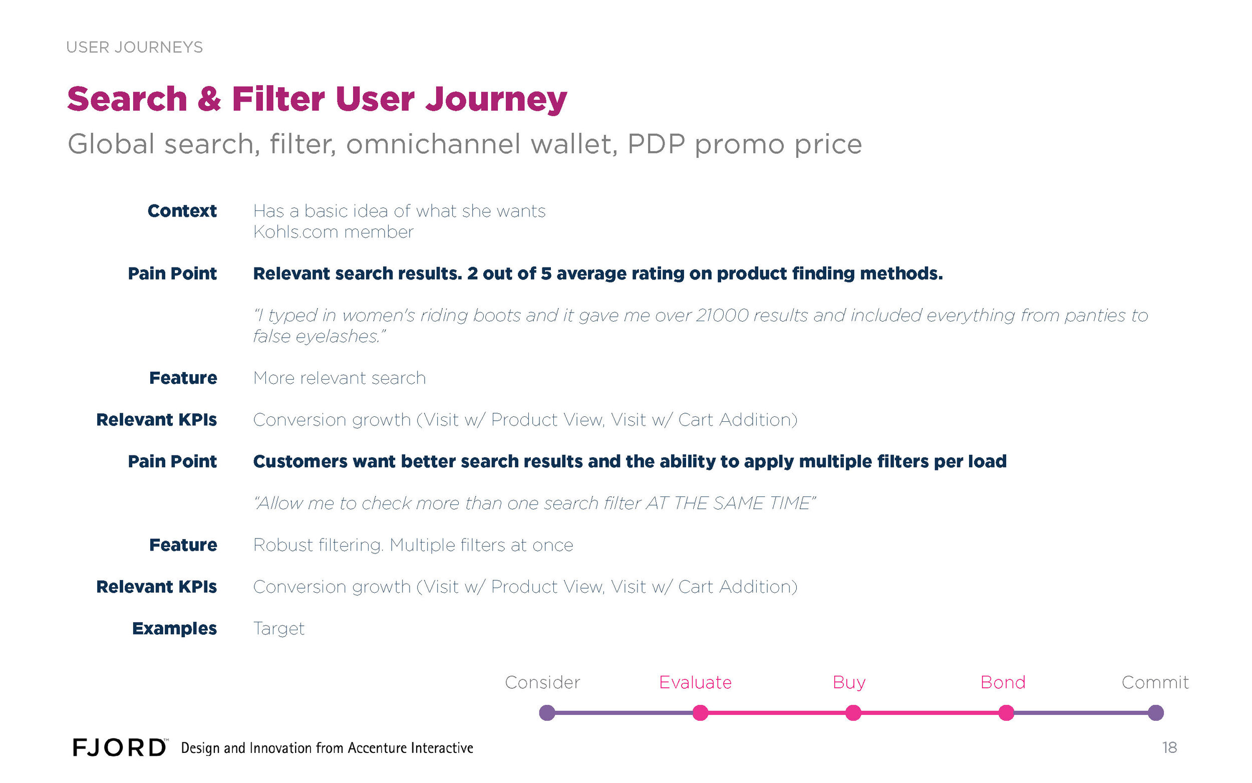
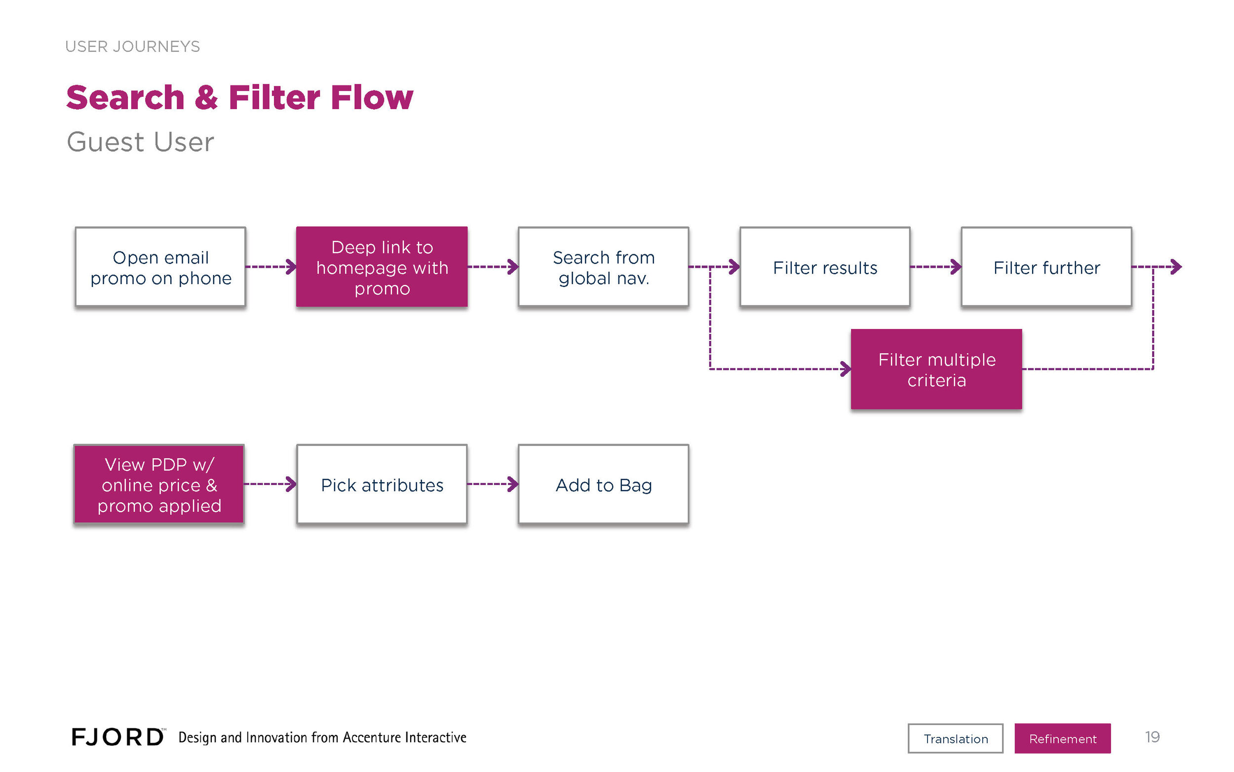
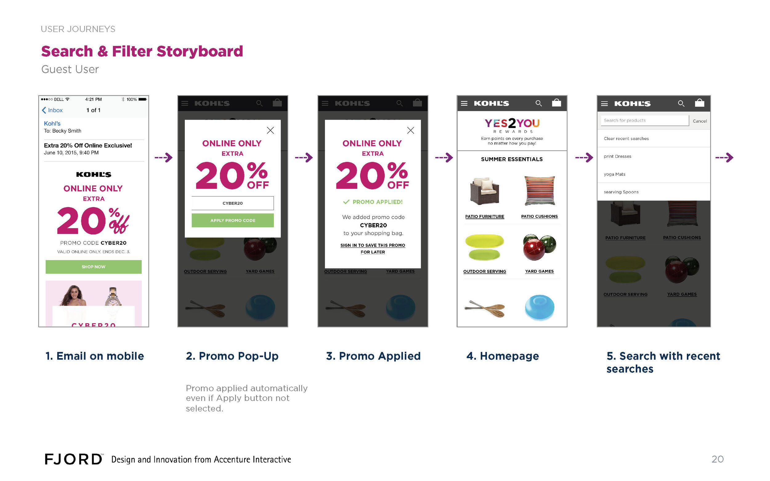
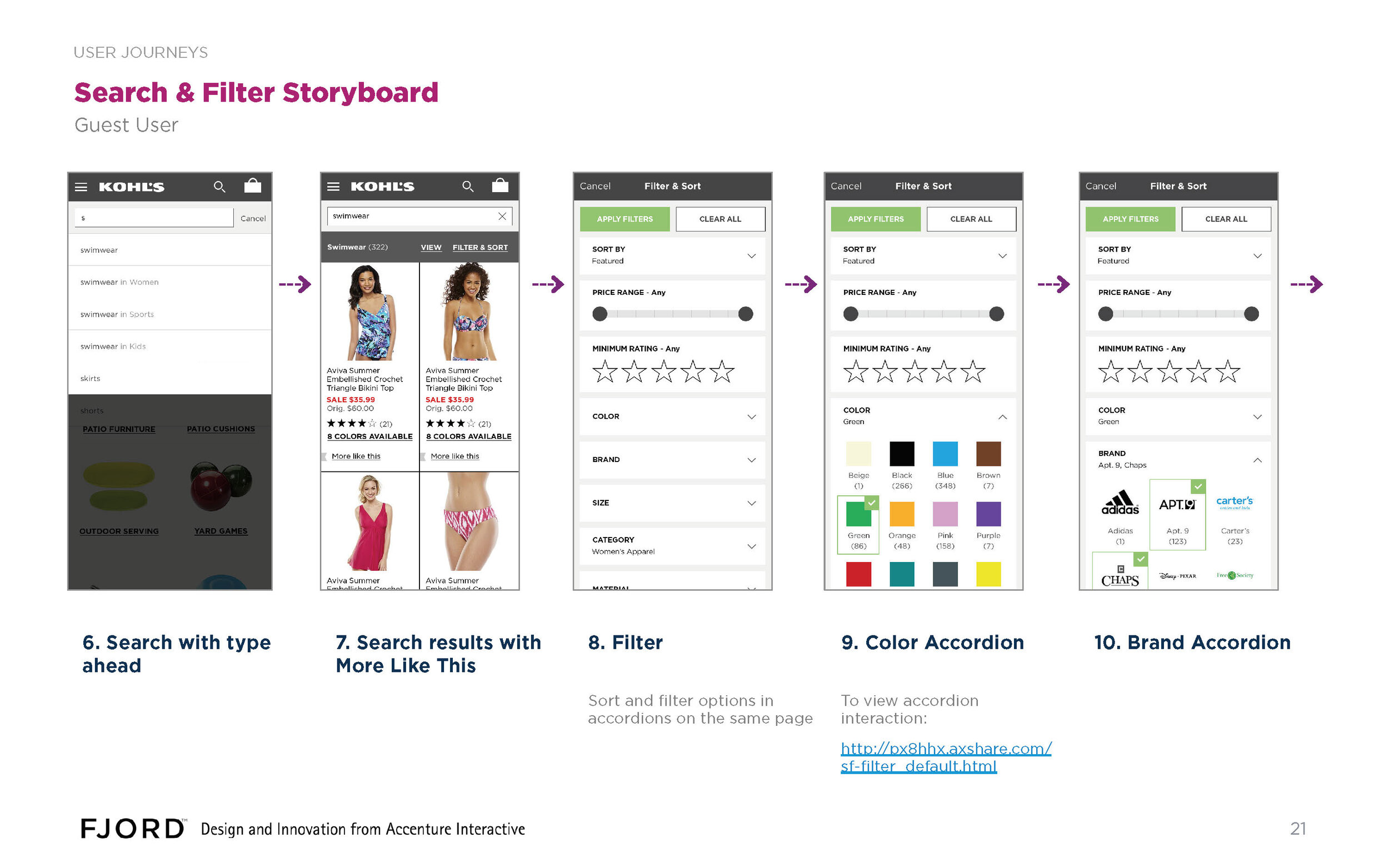
Among the most prominent opportunities we discovered: The Valley of Death - the difficulty of registration for mobile web was so high, that very few customers actually made a purchase there. Conversely, committed customers who had the app made purchases with regularity. How might we bridge the gap? One Click Checkout - Powerful way to reduce the height of the attrition funnel on mobile. You have to have all the payment and shipping data already though to make it work. At the time, Amazon owned a patent on this, but competitors were licensing it. Light Registration - Entering a name and email instead of an entire shopping profile is a significantly lower barrier to entry. By making it easier to establish an initial relationship with the company, it stood to reason, we could incubate a larger crop of new customers. Search Autocomplete - Autocomplete, where the system suggests properly spelled, known category names and descriptors, is an integral part of a successful search. Most all retailers we looked at have this feature. Filtering Results - Once a search query has produced a relevant result, the user frequently needs to filter in order to get that result down to a manageable number of entries. A quality interface can make a big difference here, esp. on a small screen.
Define
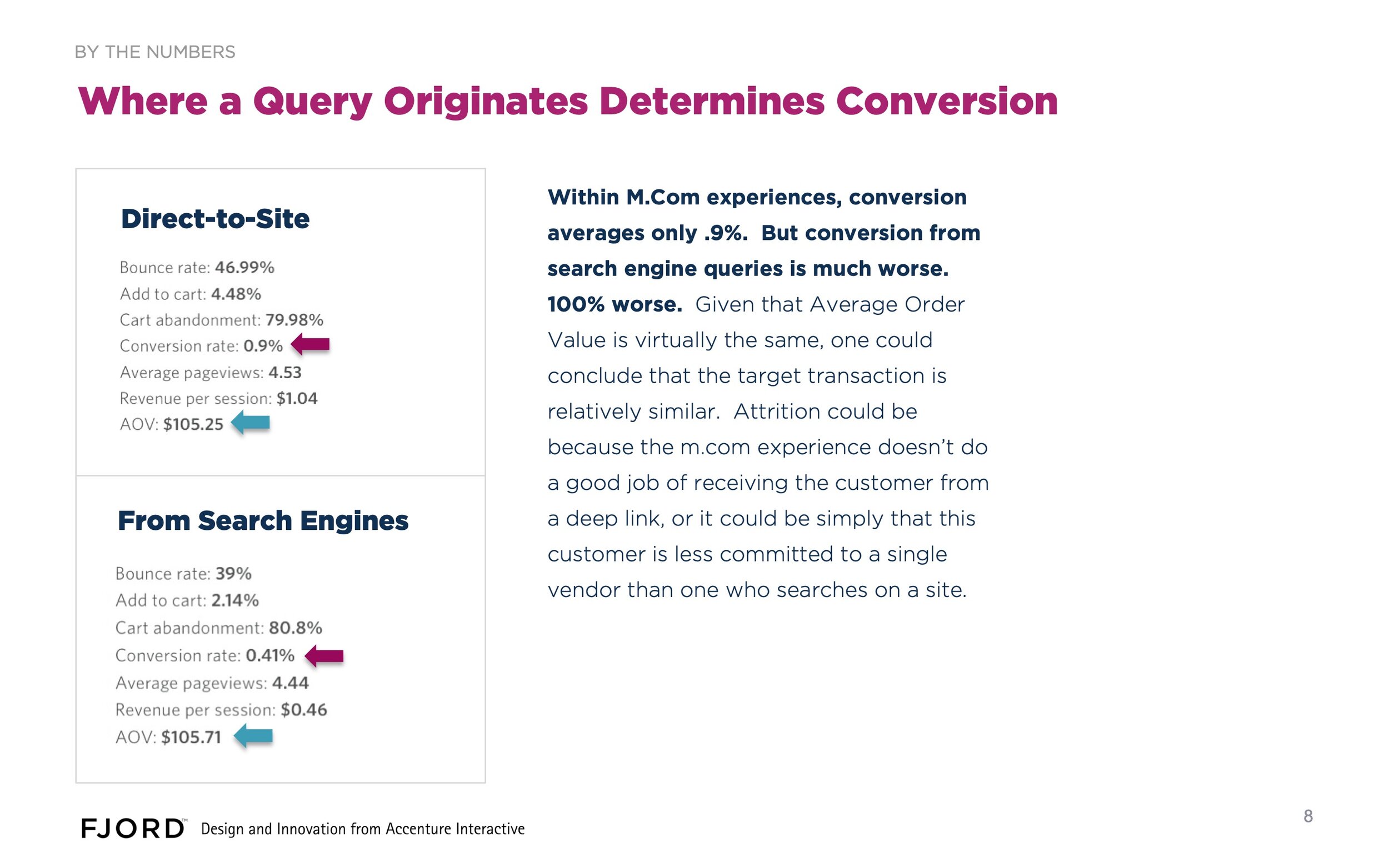
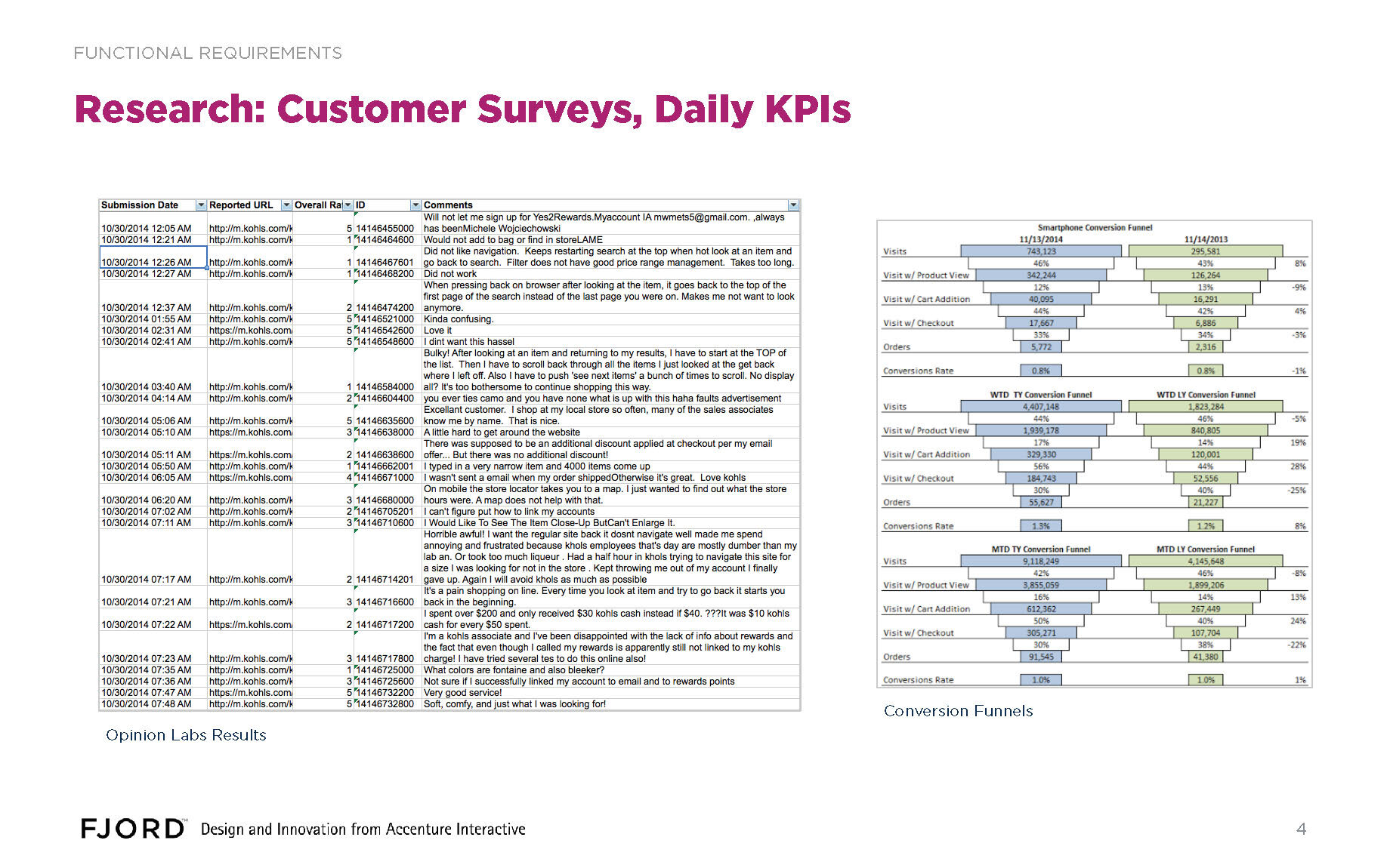
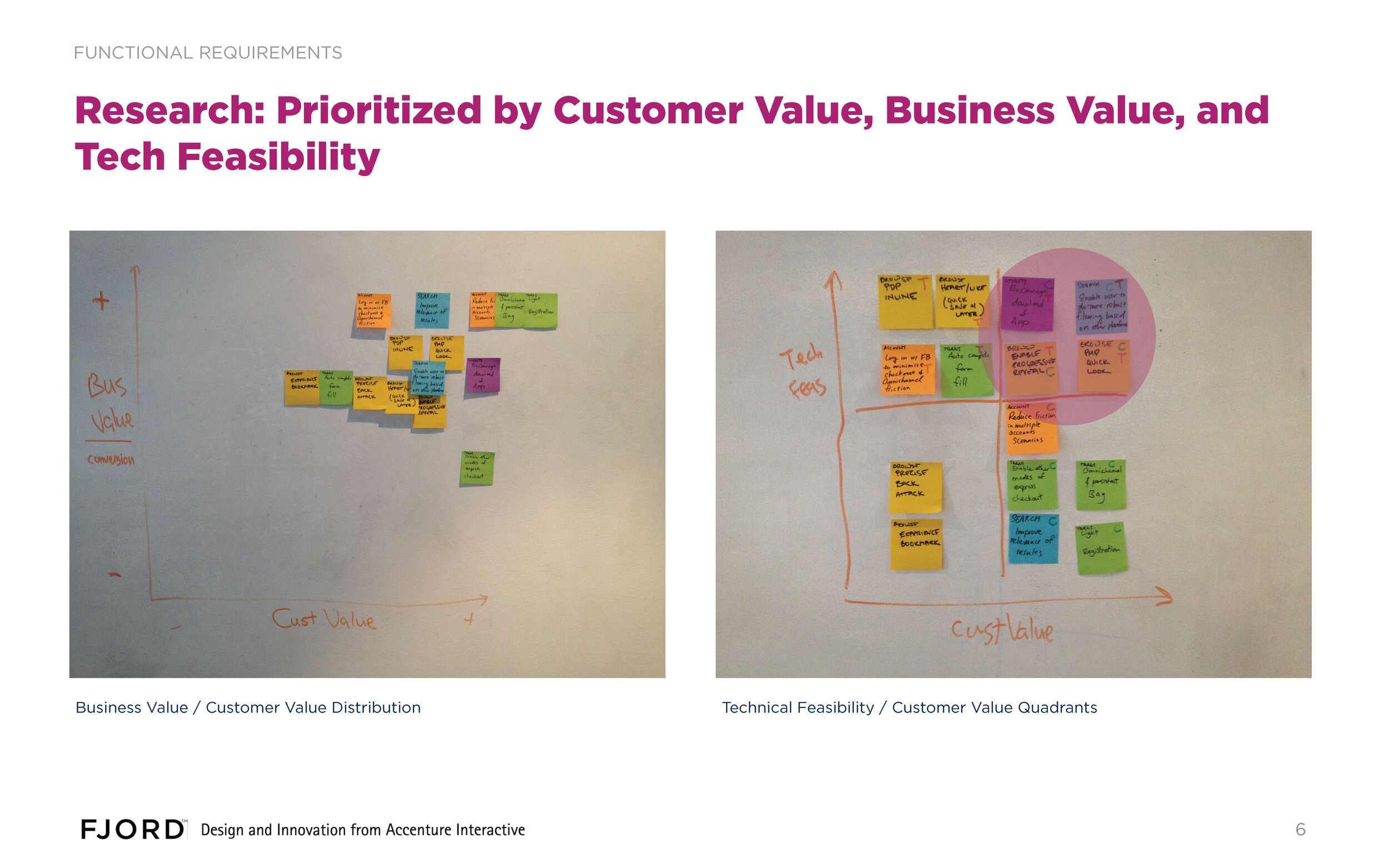
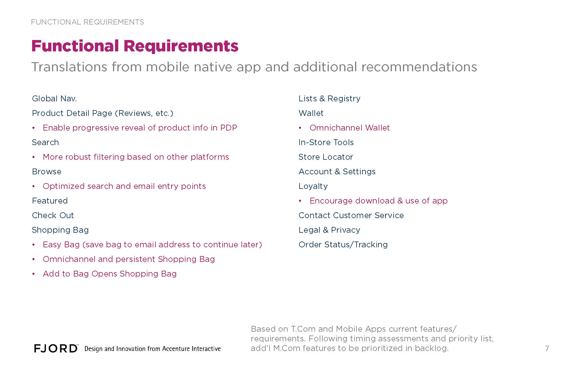
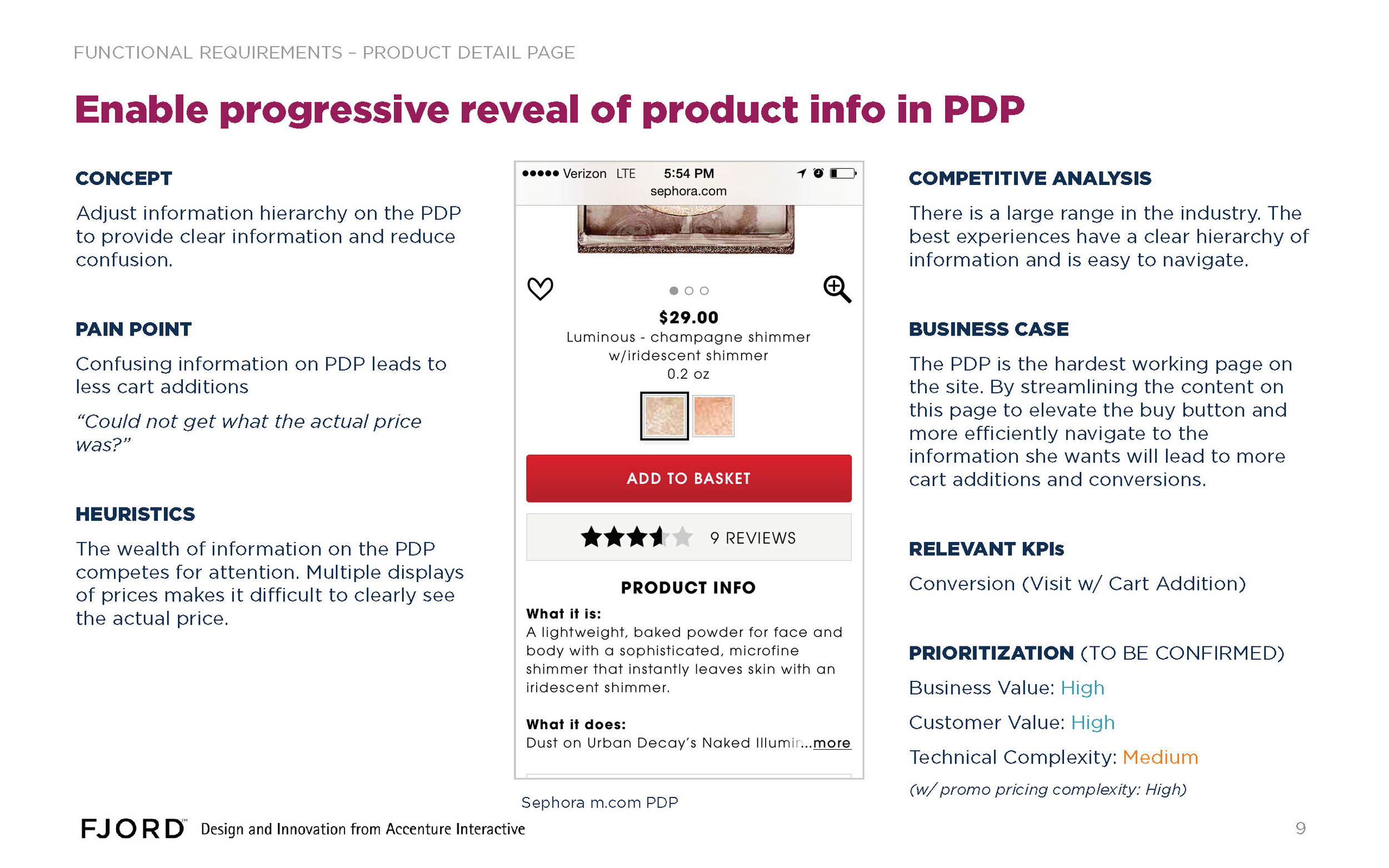
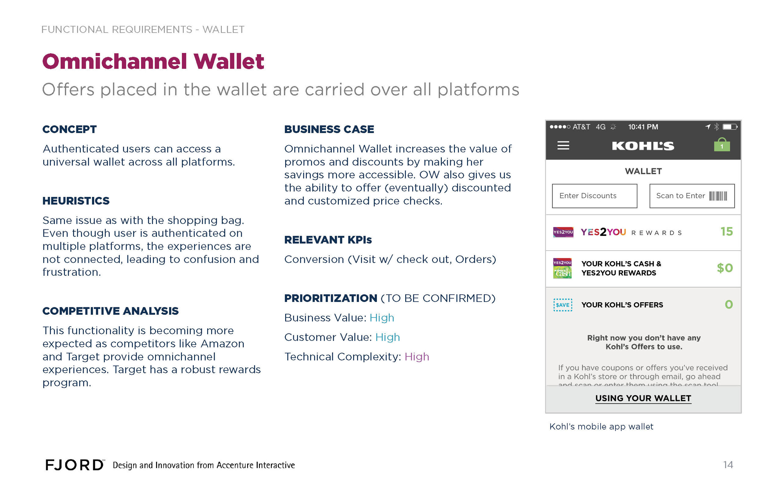
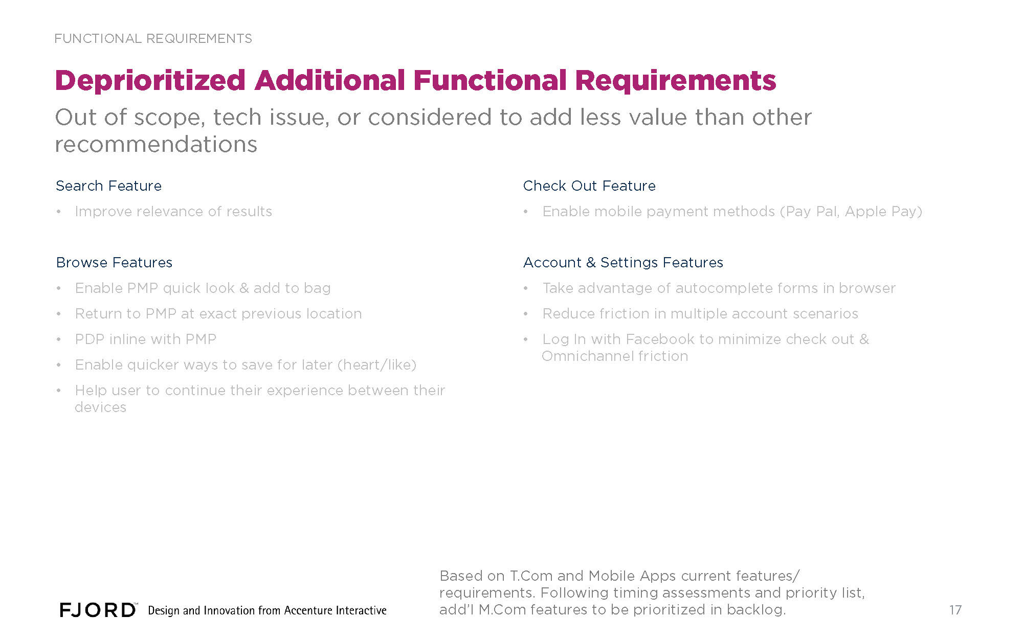
We also examined Kohl’s existing conversion funnels, and opinion lab results, which we used to shape the functional requirements for m.com.
Ideate
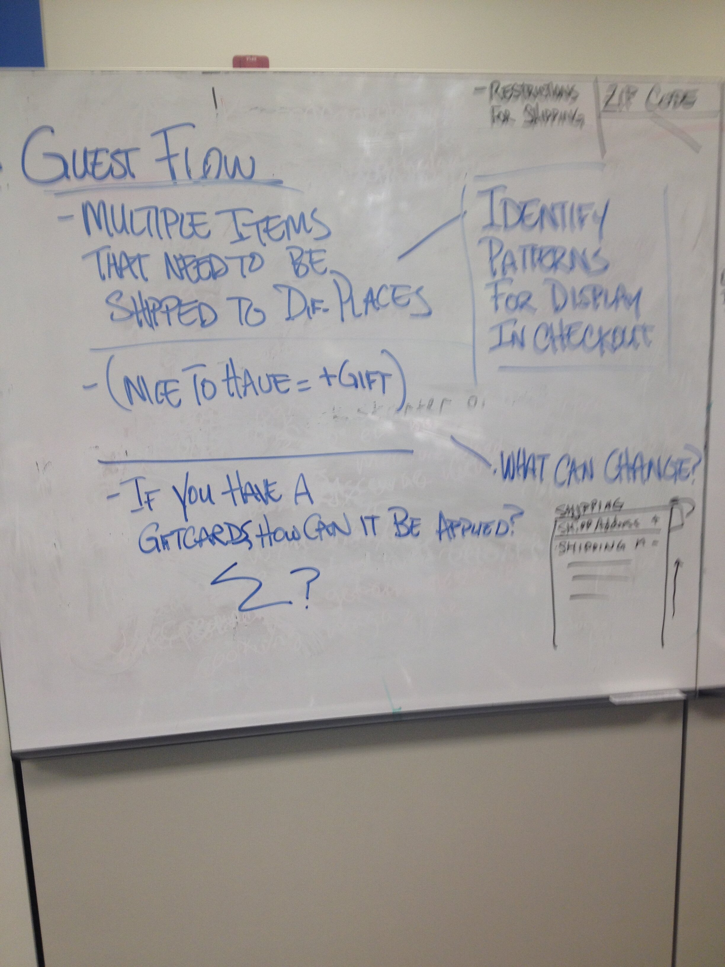
For checkout, we started out at the whiteboard, mapping out the existing checkout flow, and identifying opportunities to improve the experience.
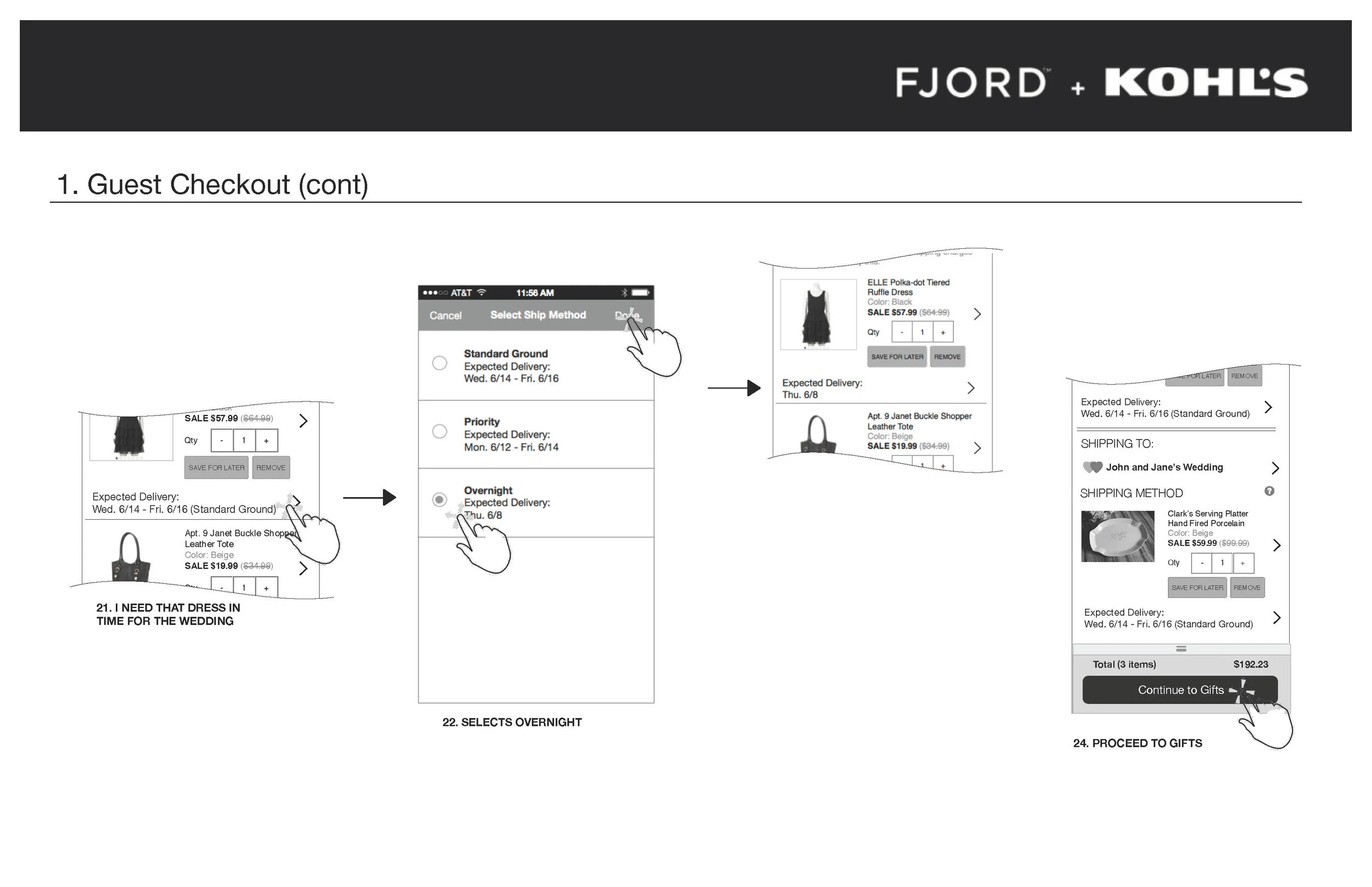
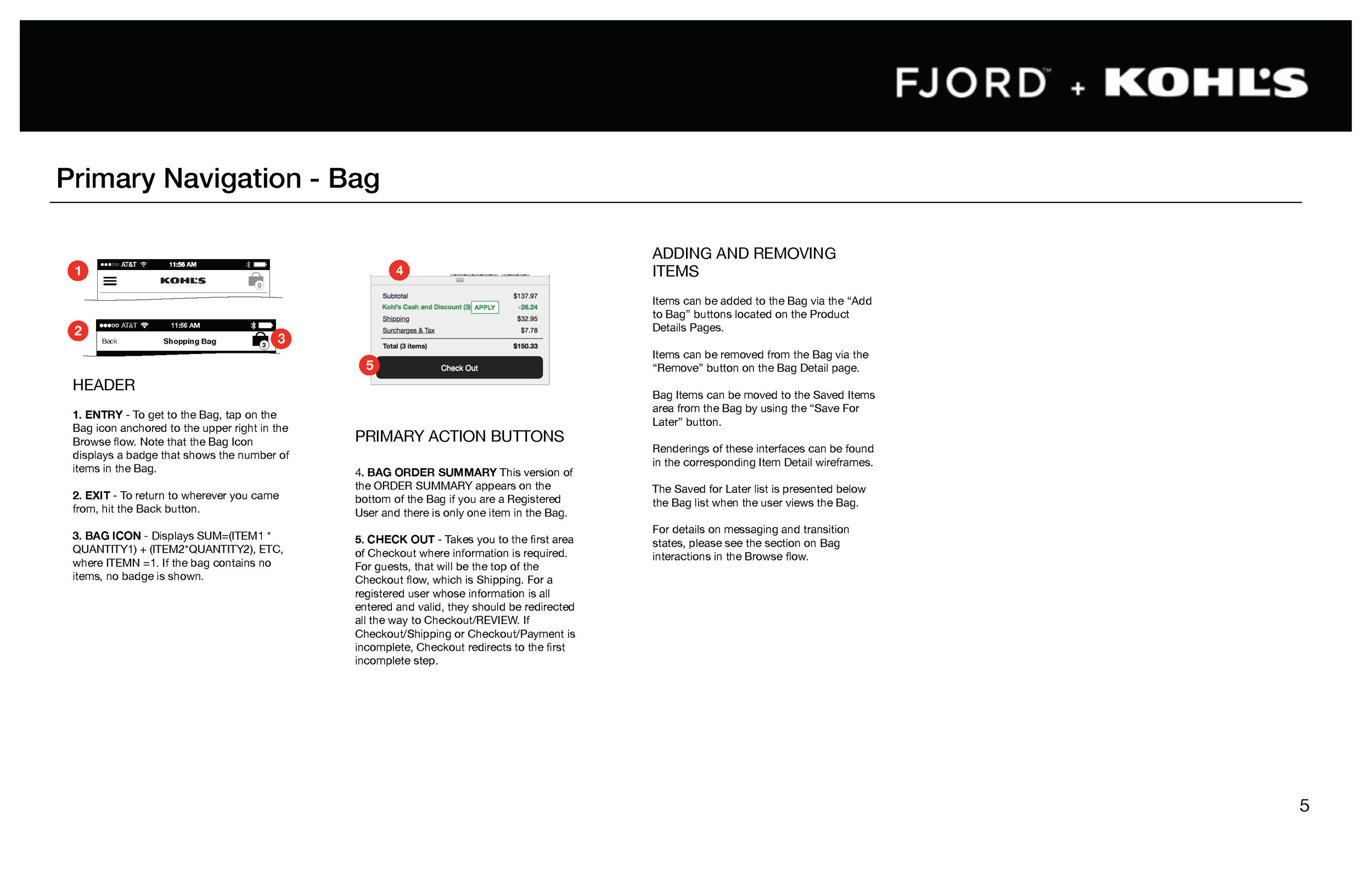
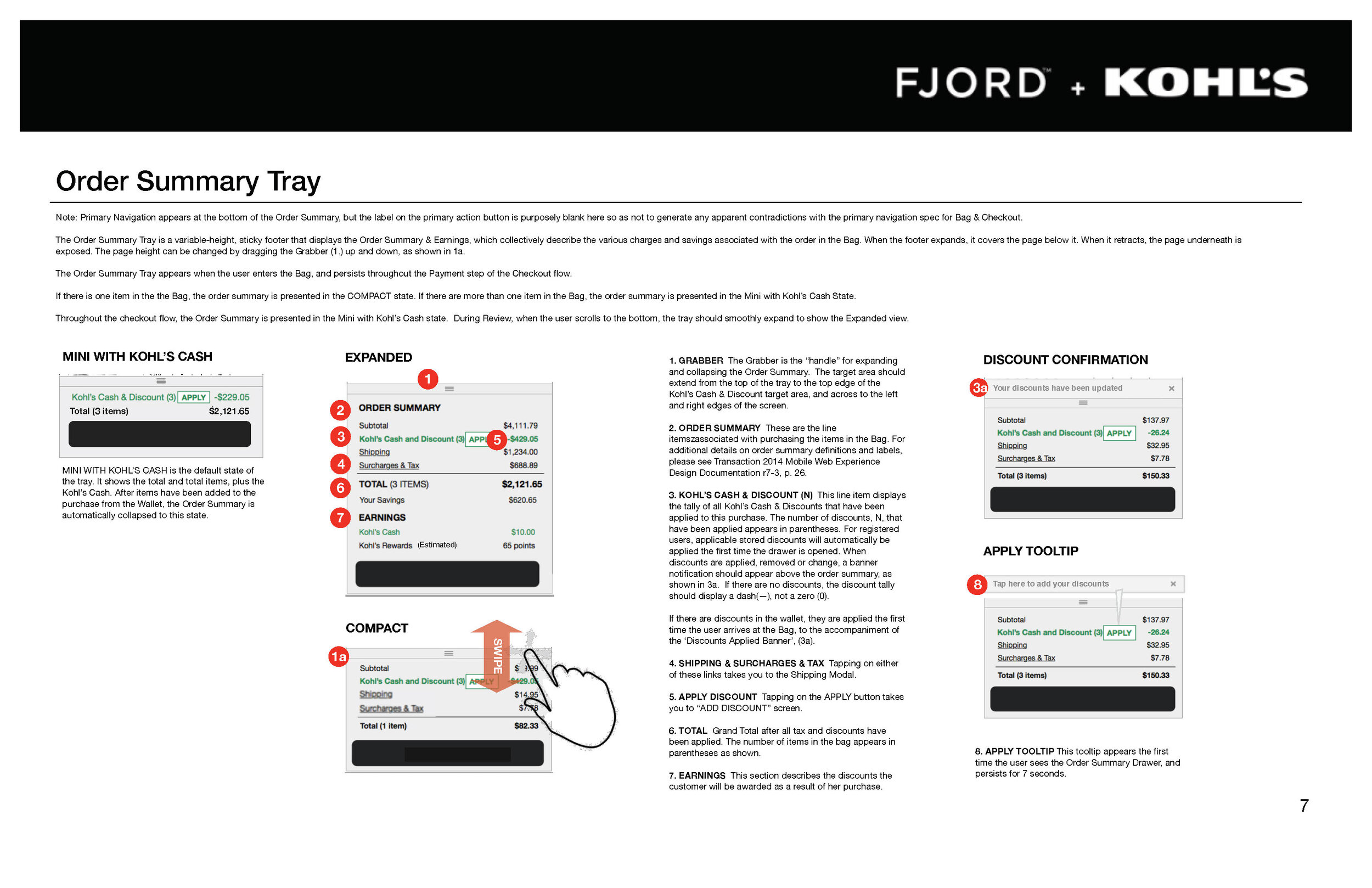
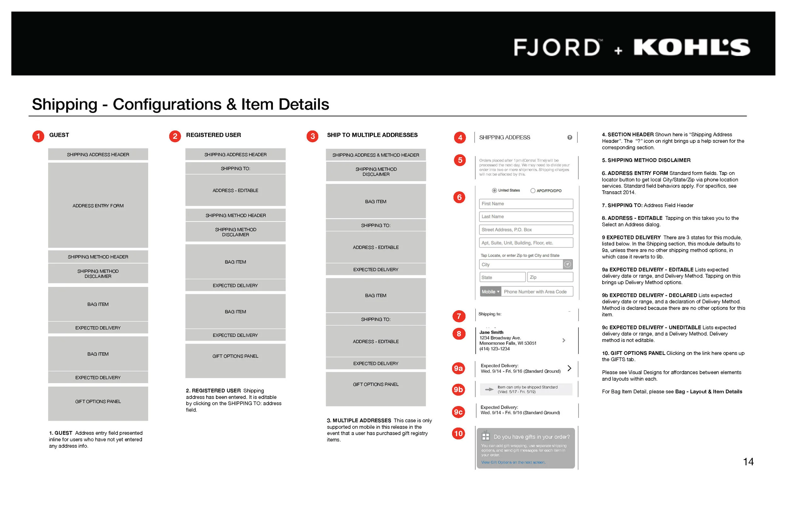
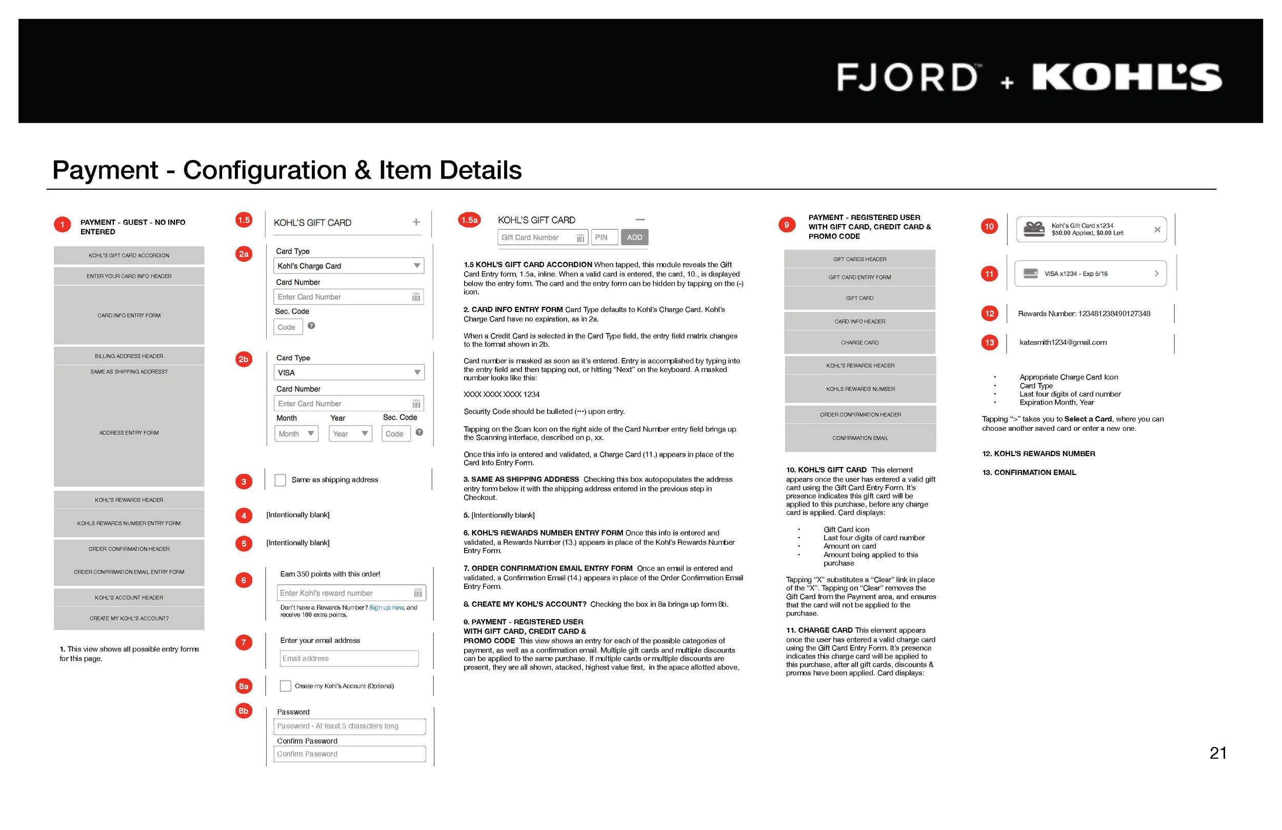
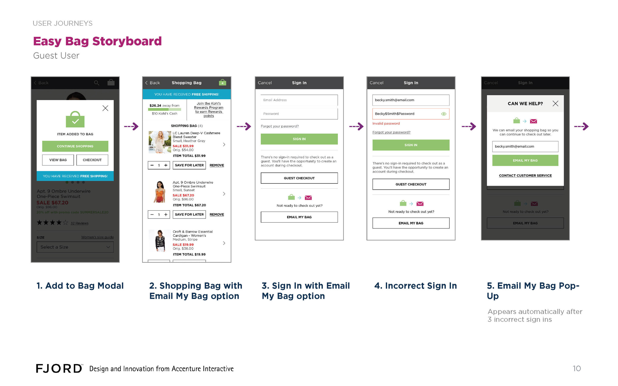
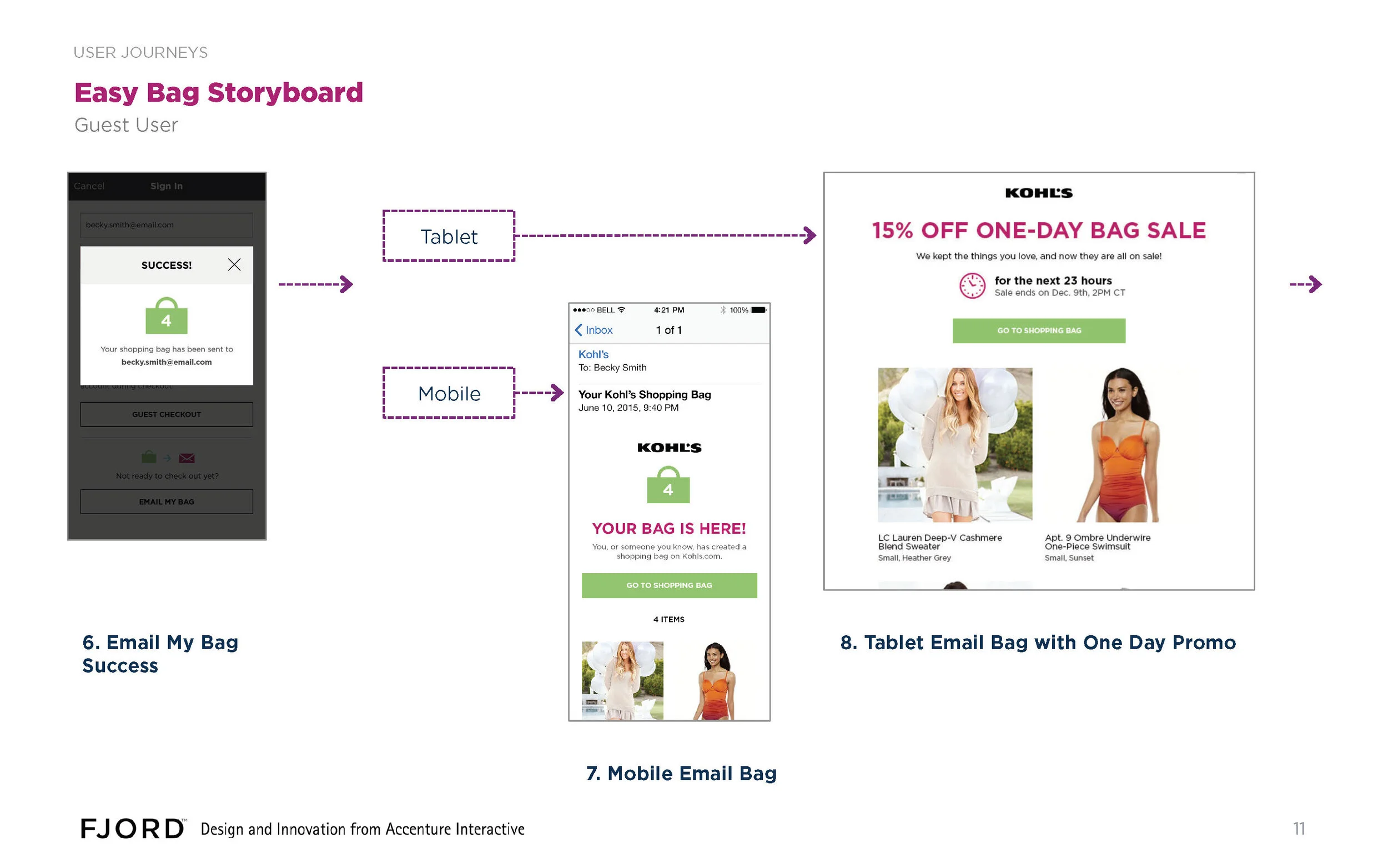
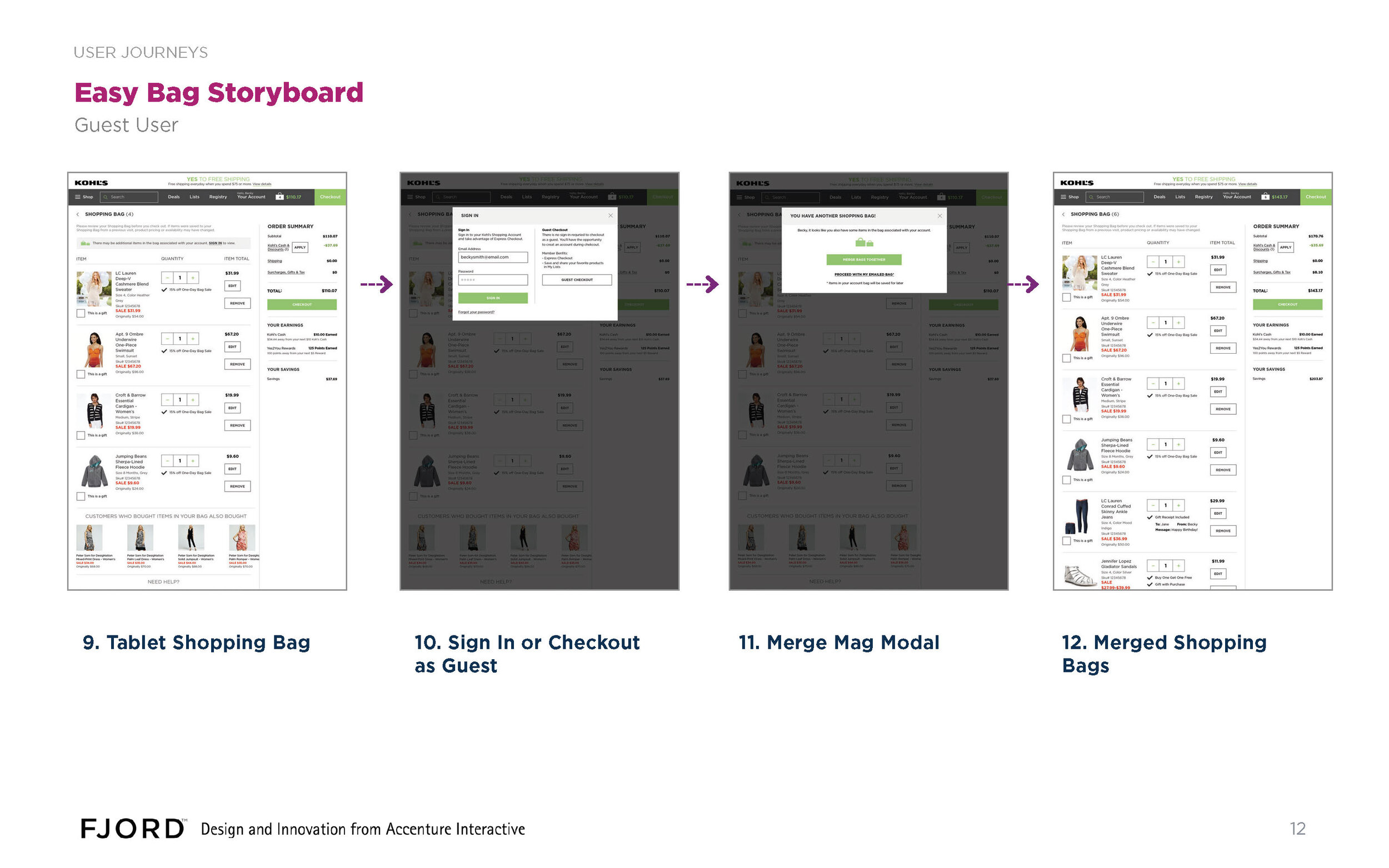
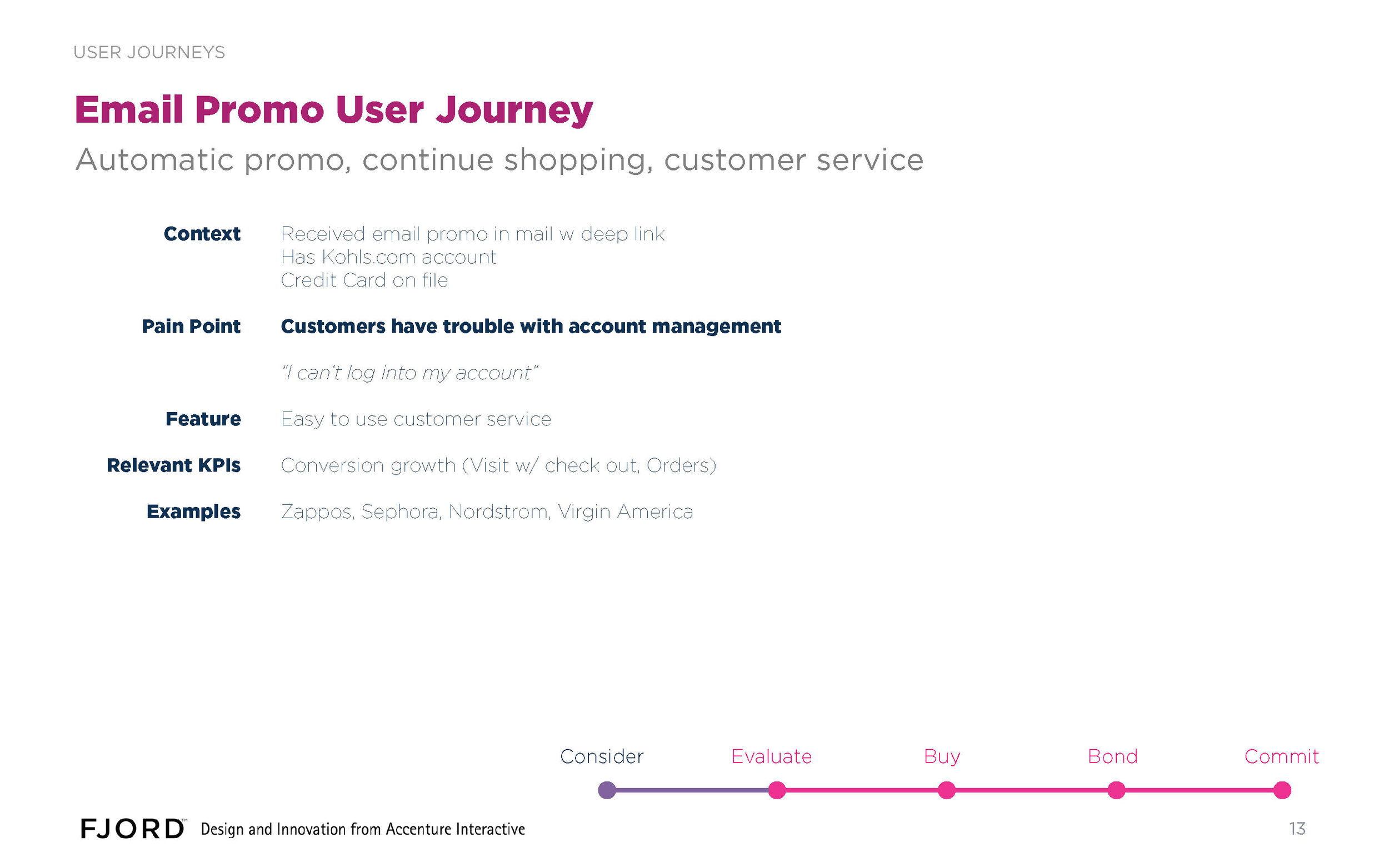
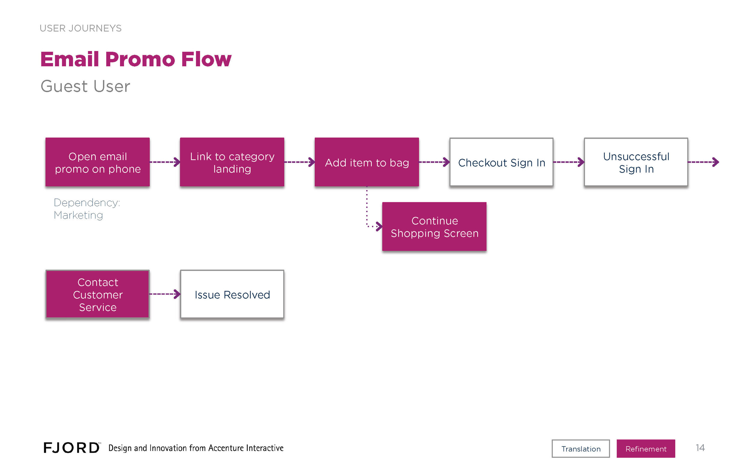
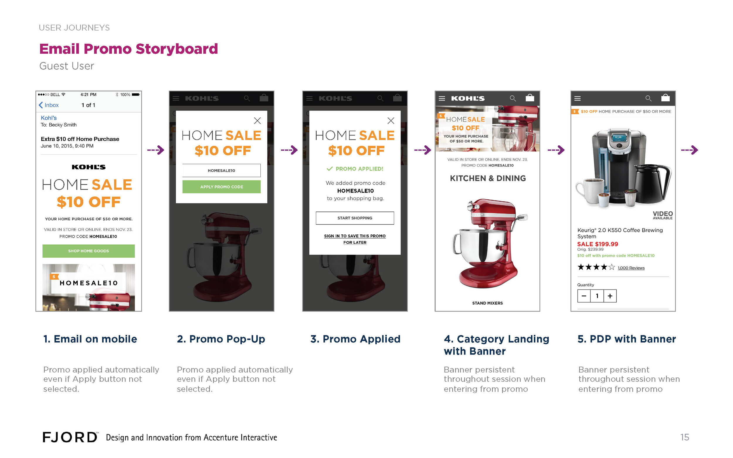
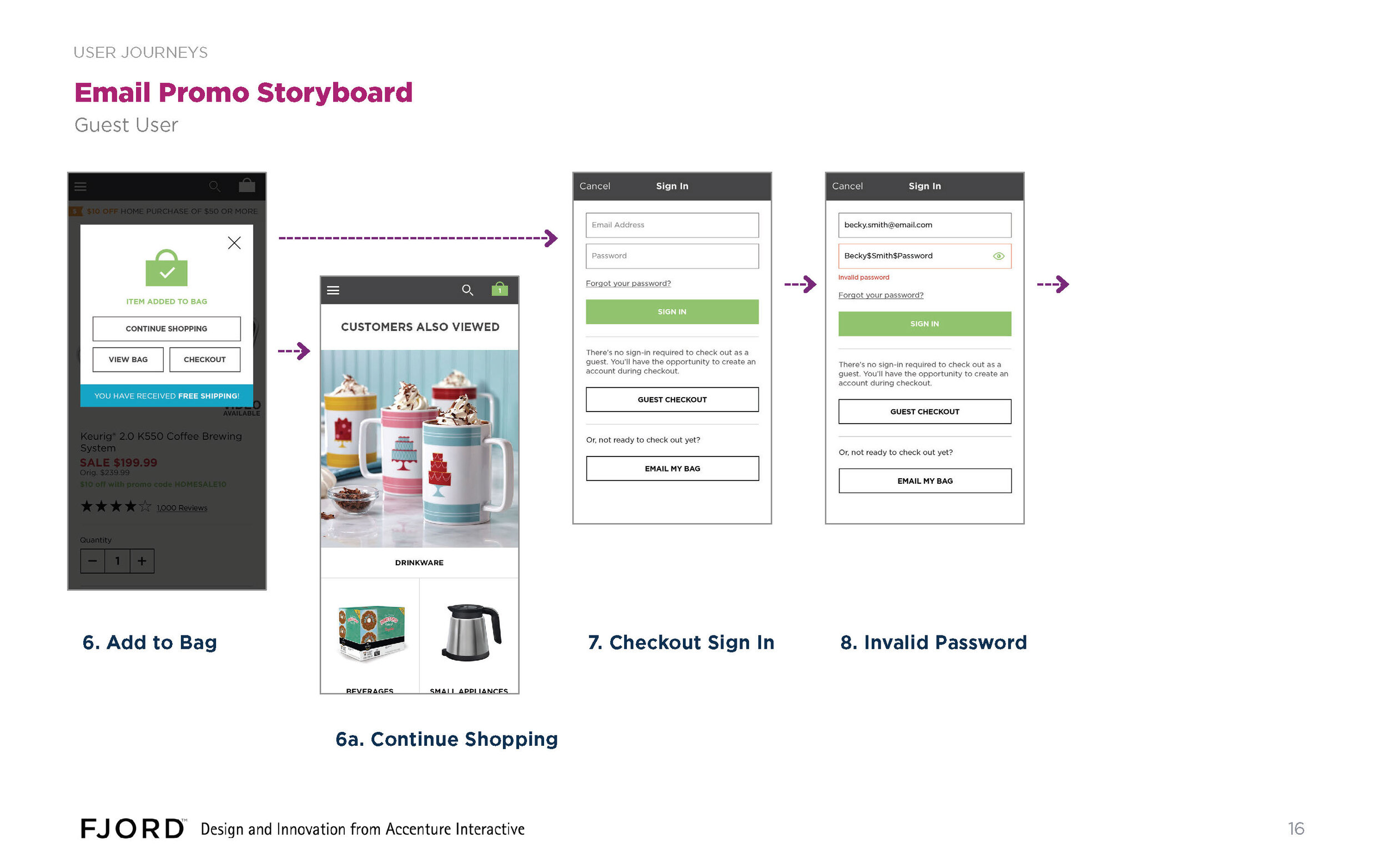
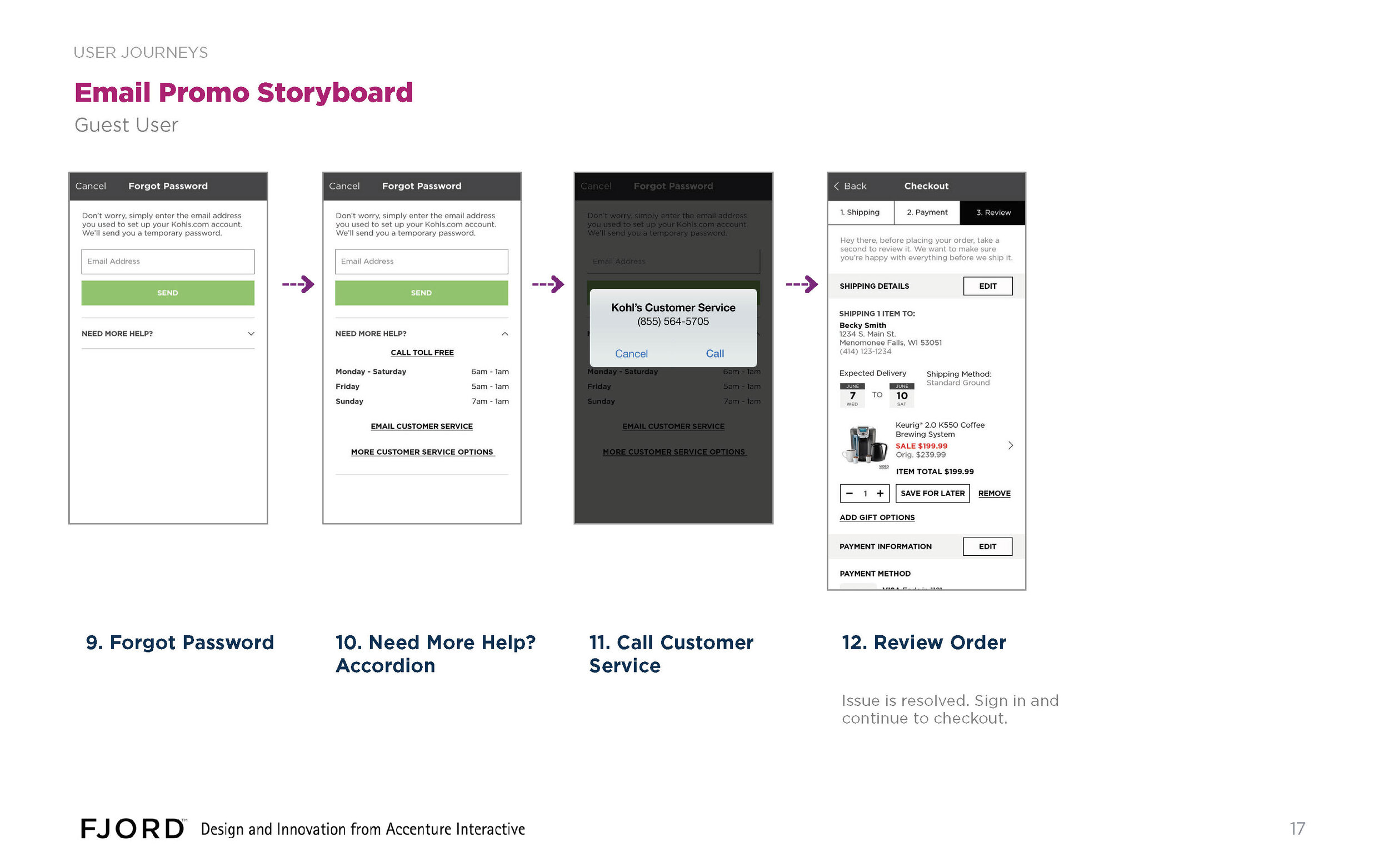
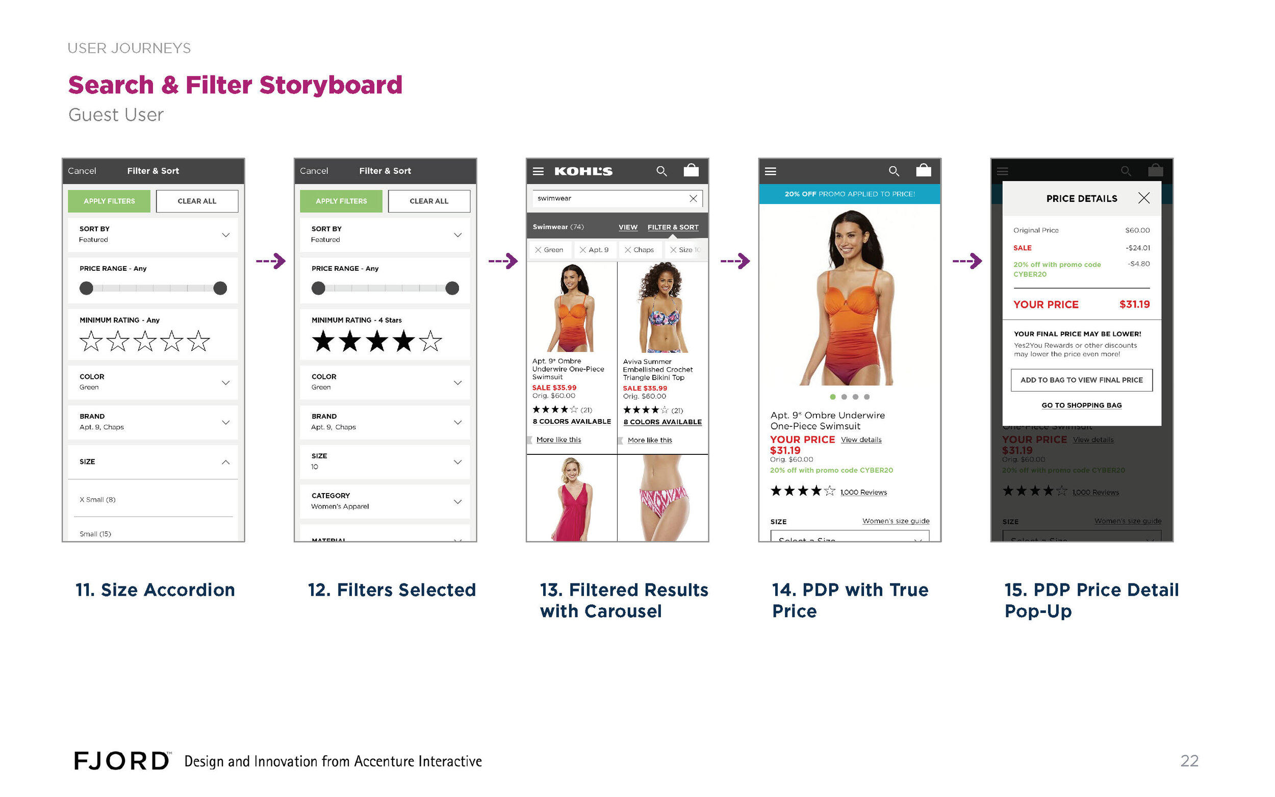
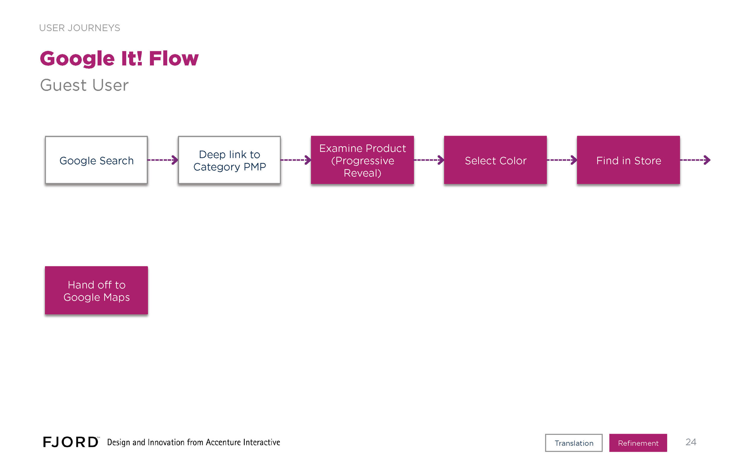
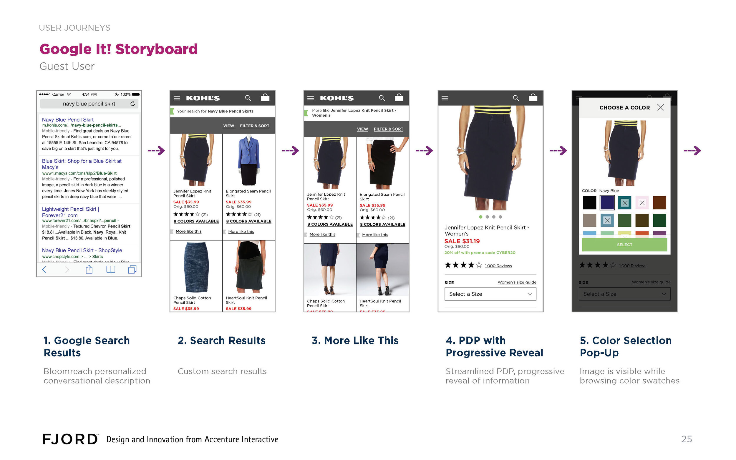
We created a series of wireframe sets, accompanied by simple journey maps, and presented them iteratively to the client on weekly conference calls. Here's an example of a drop from one of the later design cycles, featuring four key user journeys. I developed the scenarios and delivered the wires for journeys #1 and #4 (pp. 3-15, and pp. 23-28)
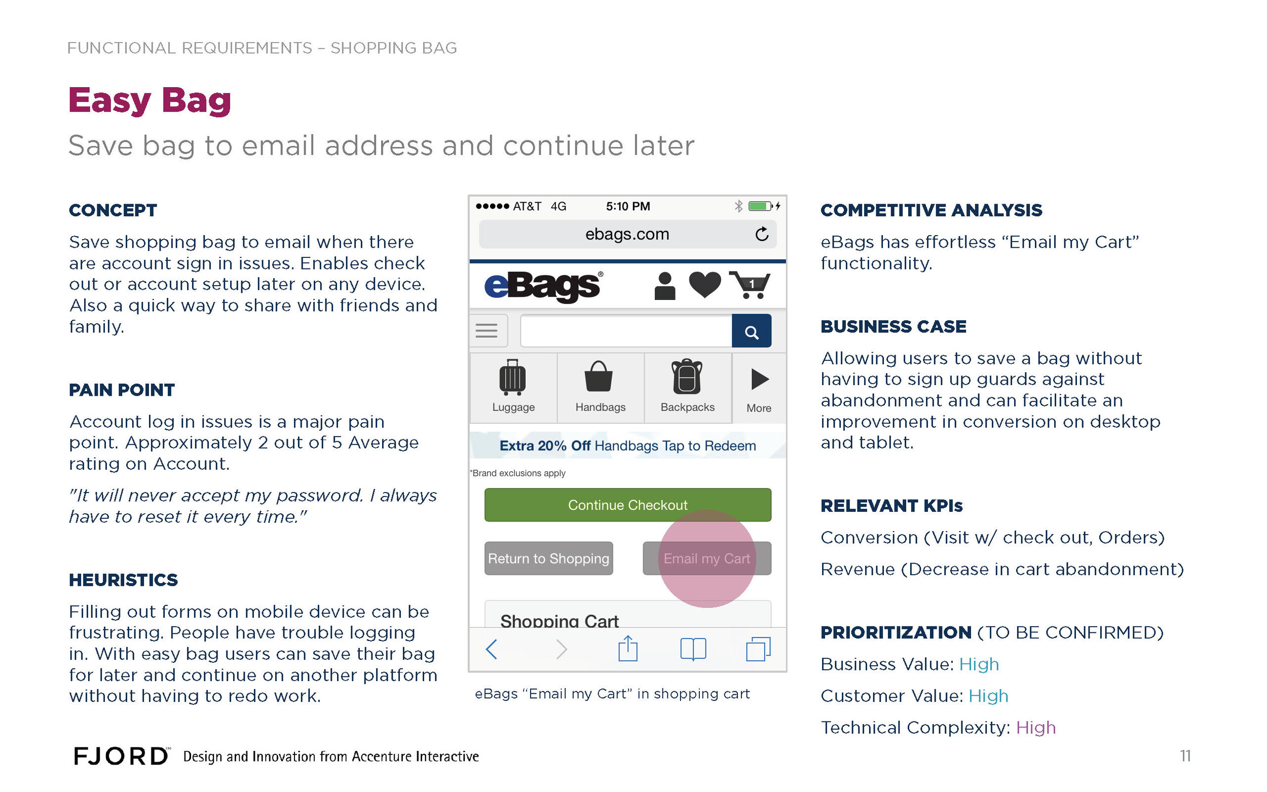
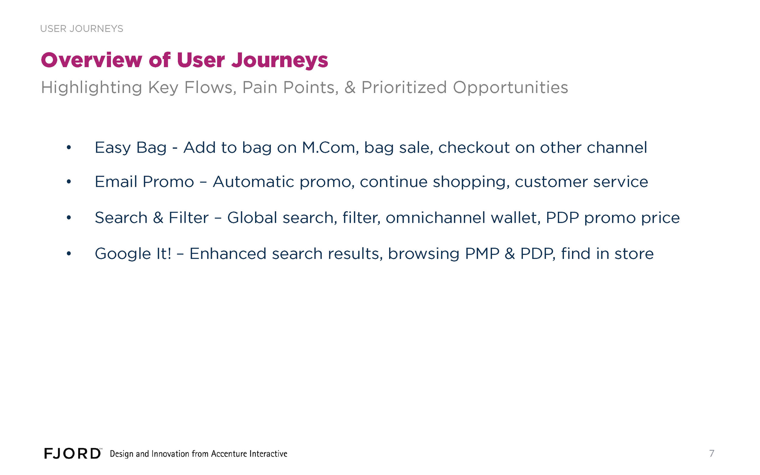
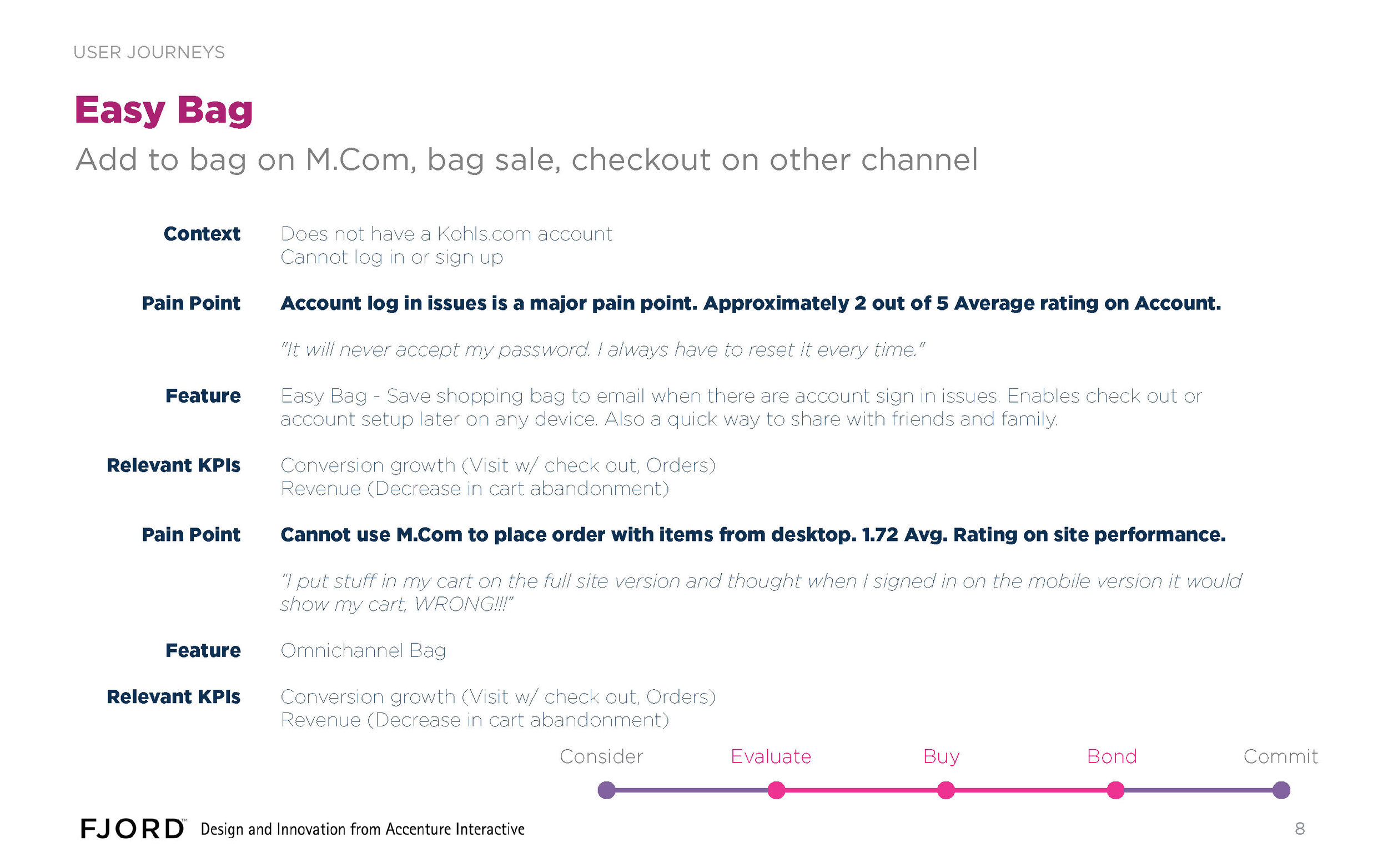
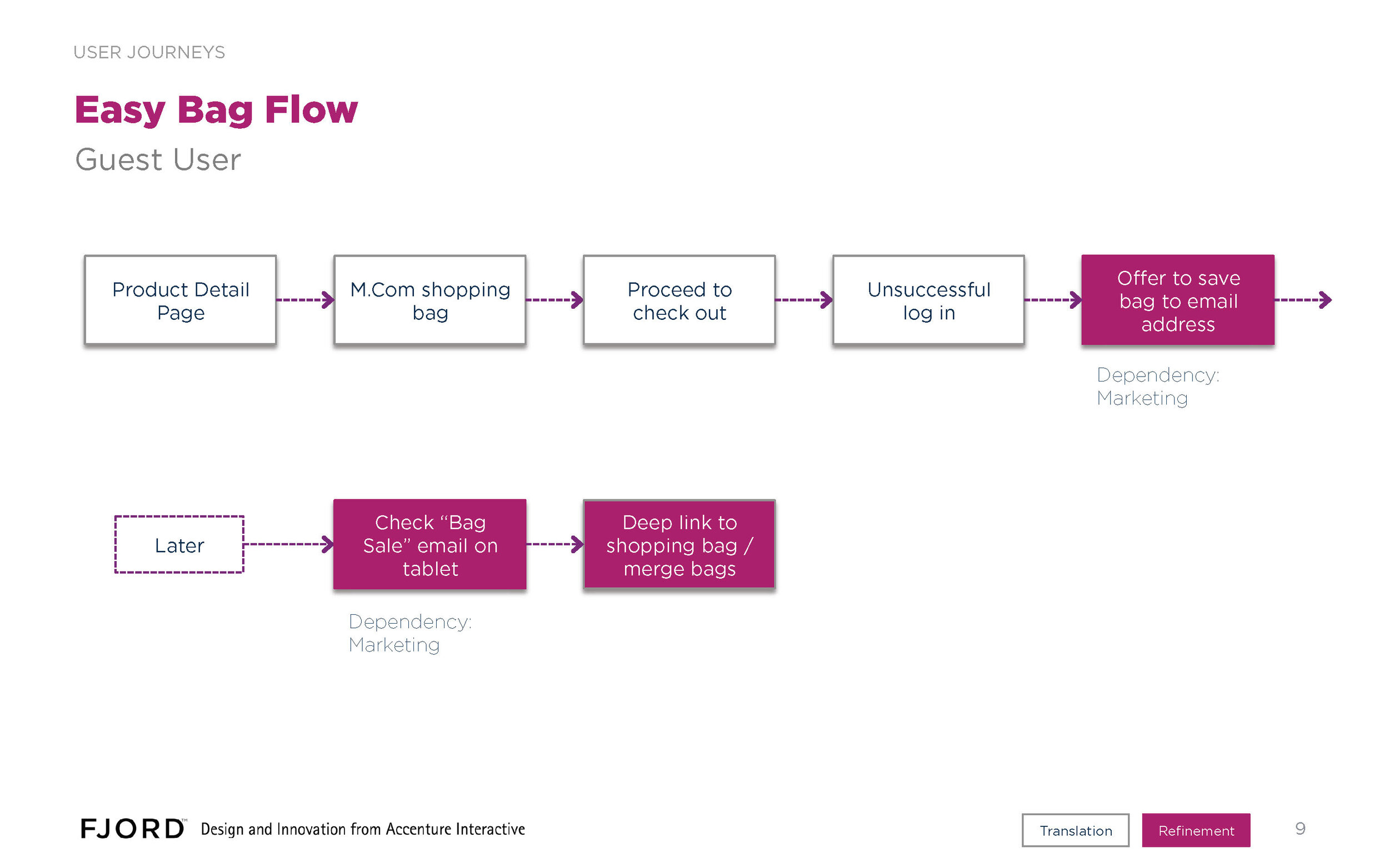
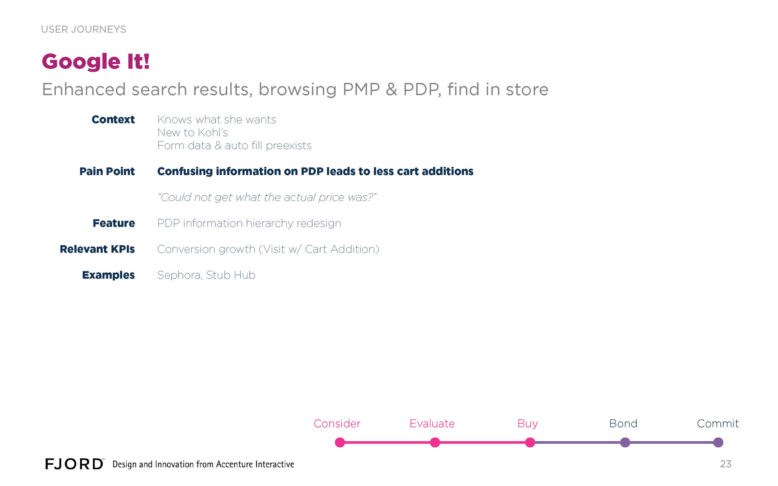
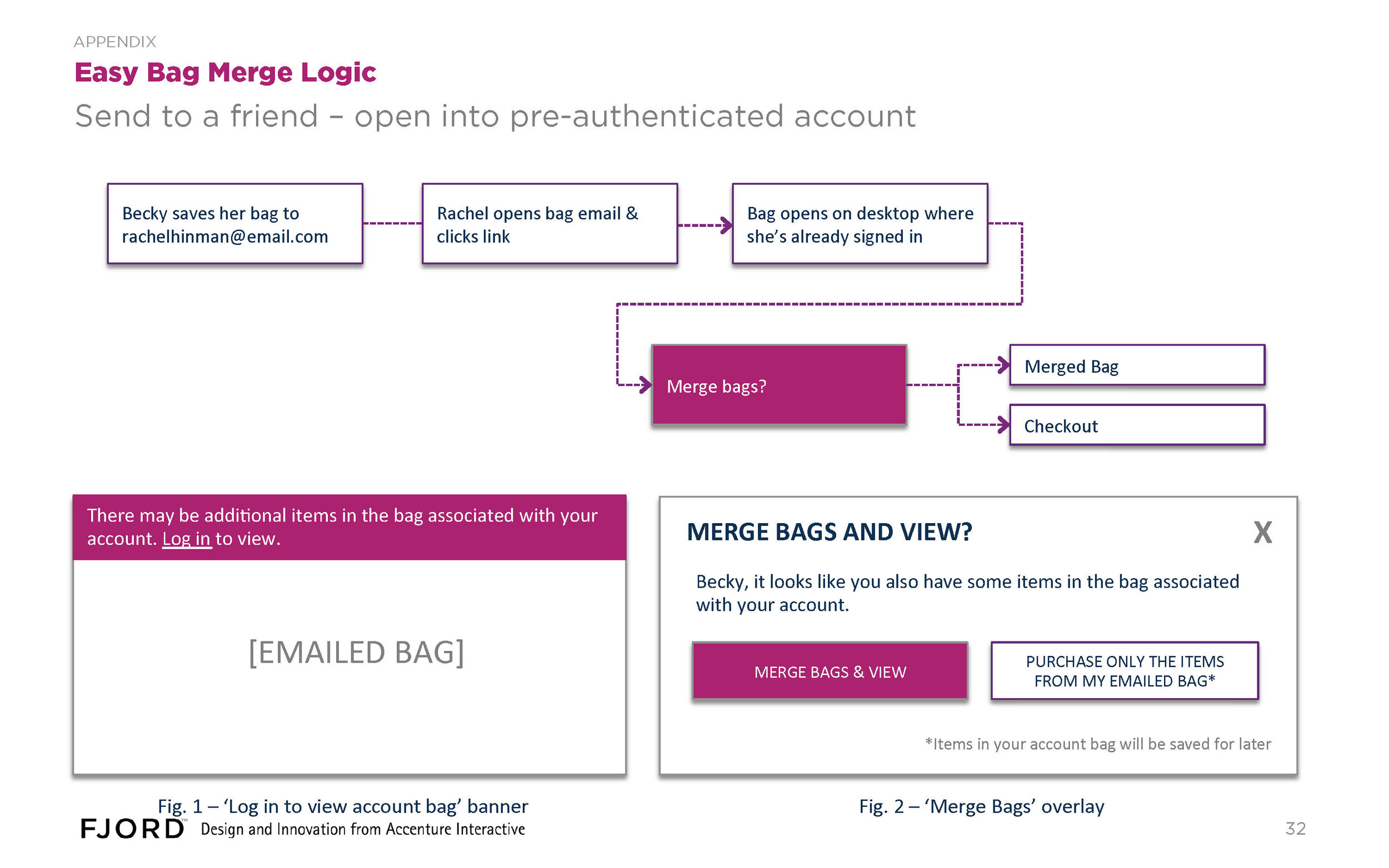
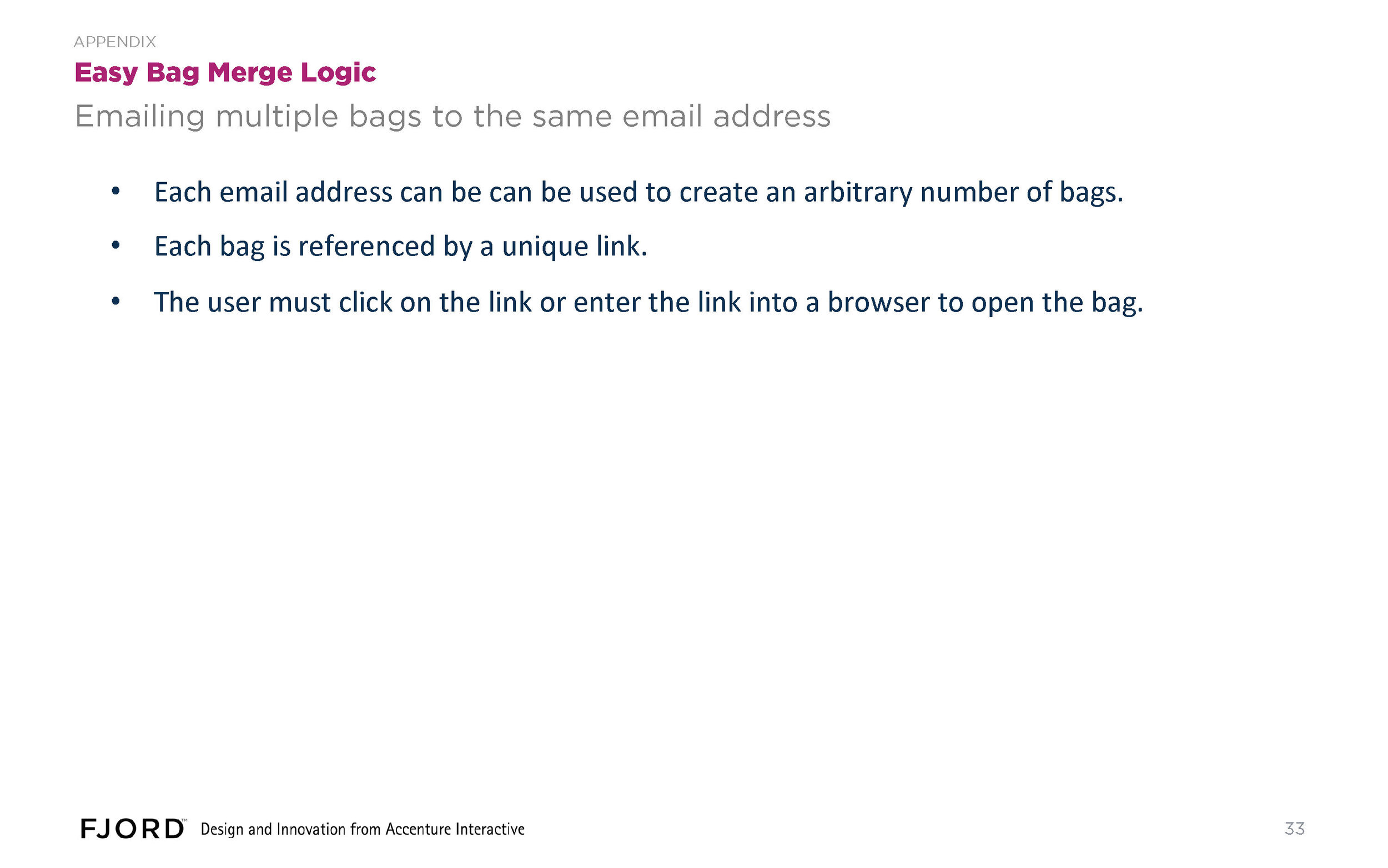
For new feature design, we worked up skeleton user journeys and vetted them with the client. Based on their feedback, we prioritized these four journeys, and delivered the following designs.
I was focused primarily on Easy Bag and Google It!, whose prime directive followed directly from findings in the heuristics study I had conducted earlier.
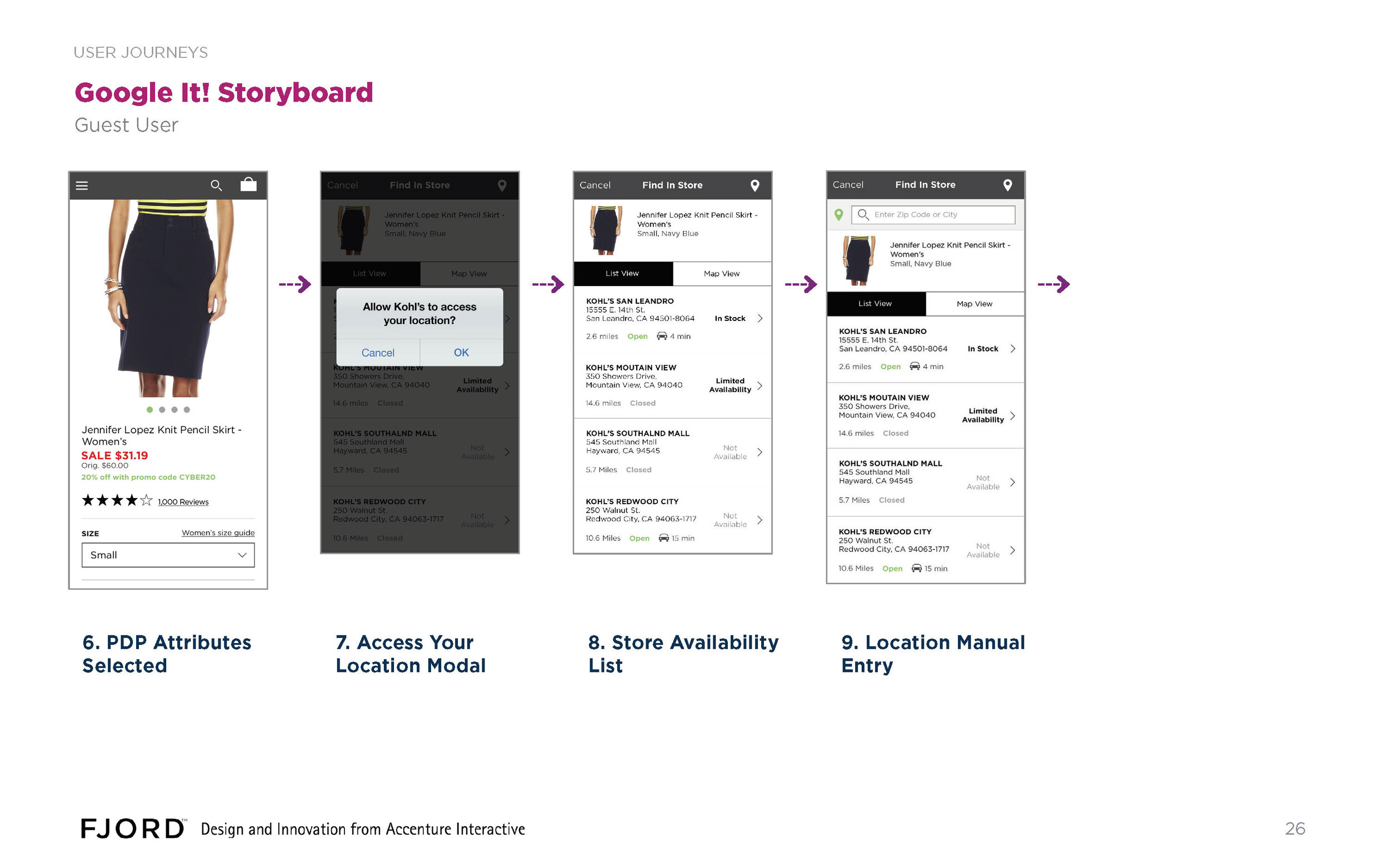
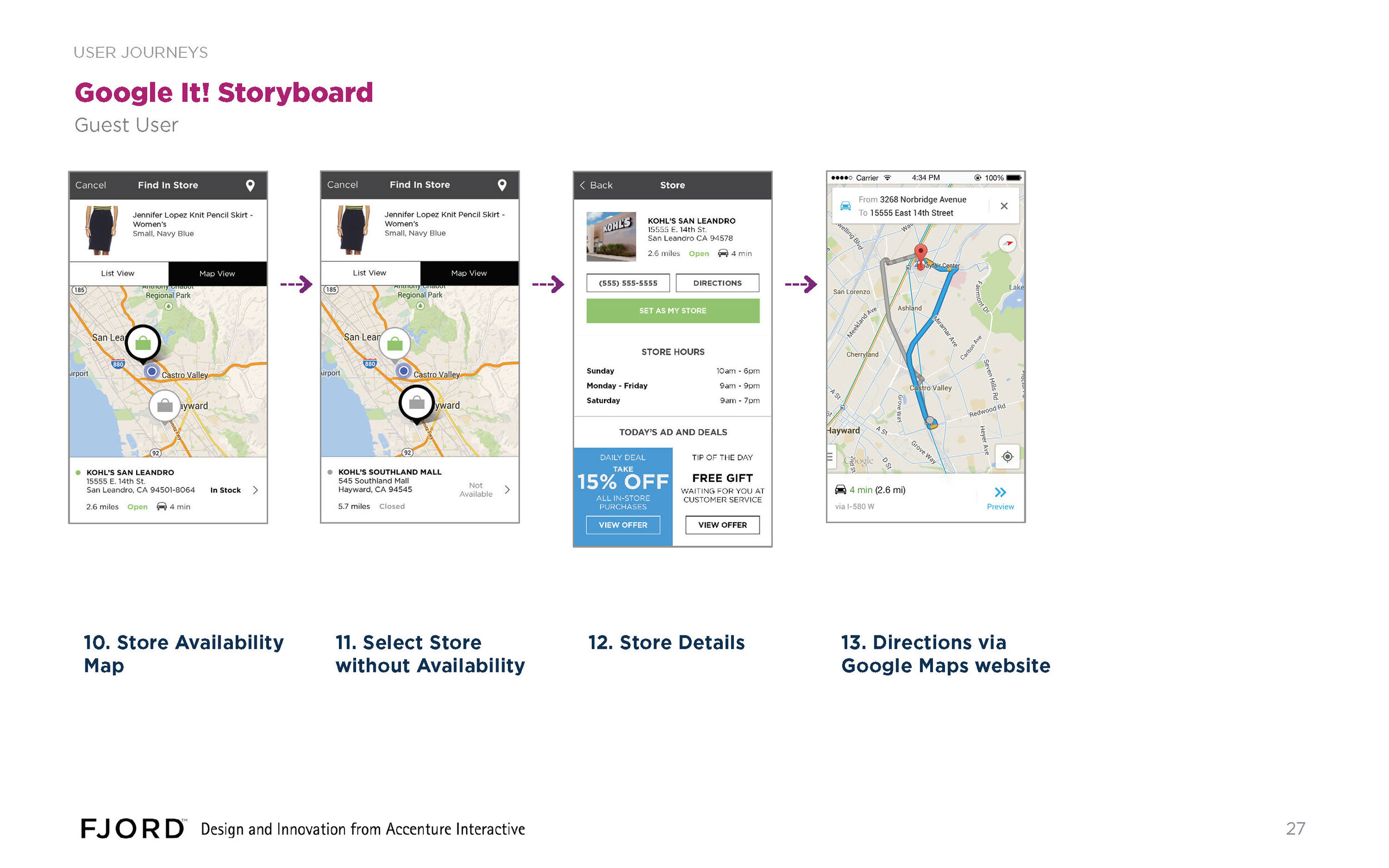

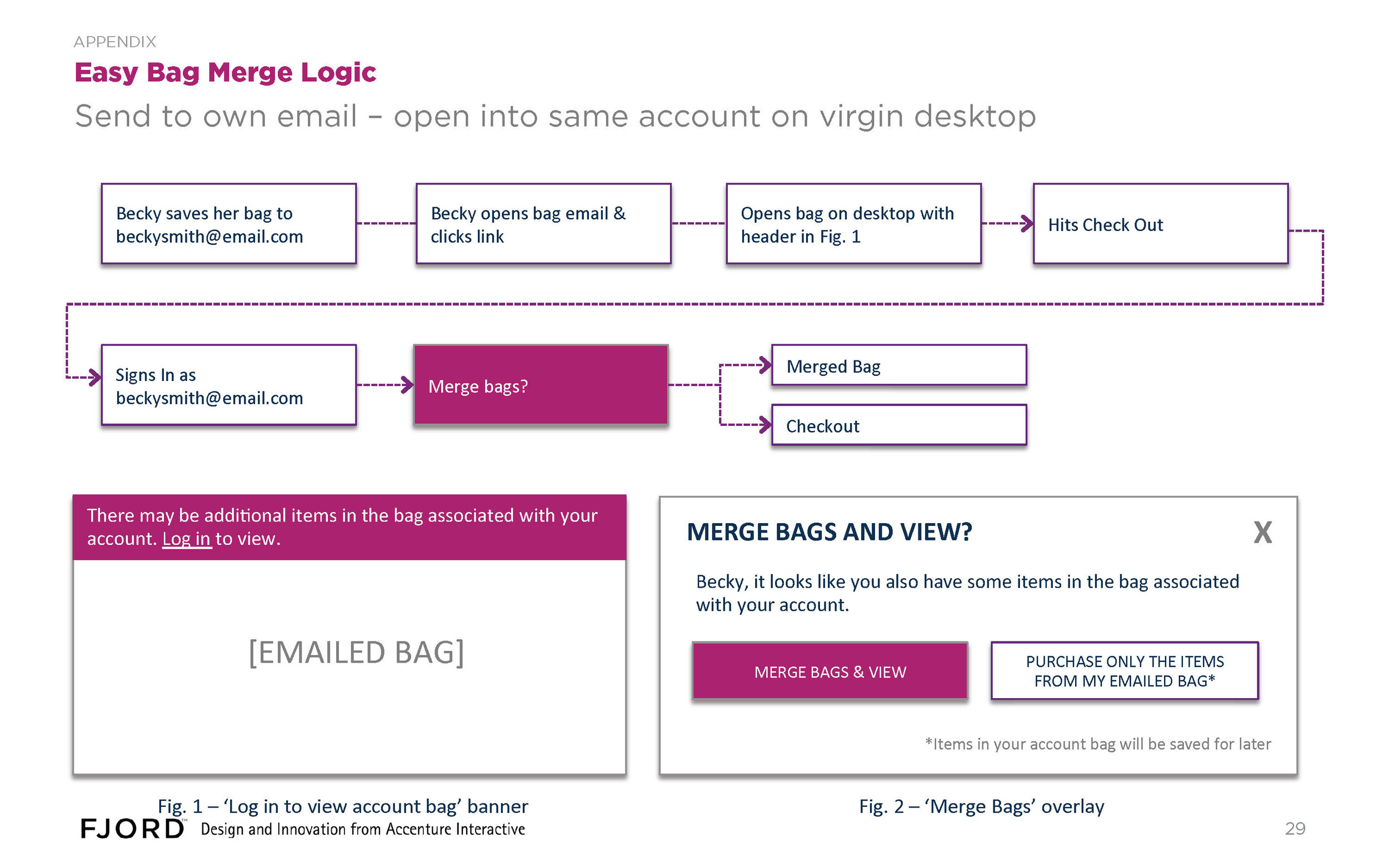
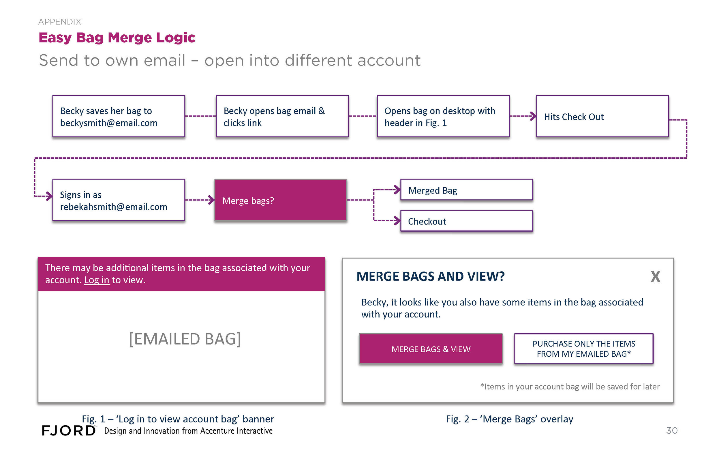

Prototype
Wires were conformed to the design system and rendered as mocks, and then prototyped in InVision.
Test
The project contracted with a user testing lab in SF to test our wireframes, and later the Invision prototype of the visual designs. The feedback helped us improve the discoverability of filters, the effectiveness of location sensing to improve the speed of address entry.
Implementation
The detailed wires and visual designs required by the hybrid onshore/offshore development team involved the creation of hundreds of pages of design documentation.
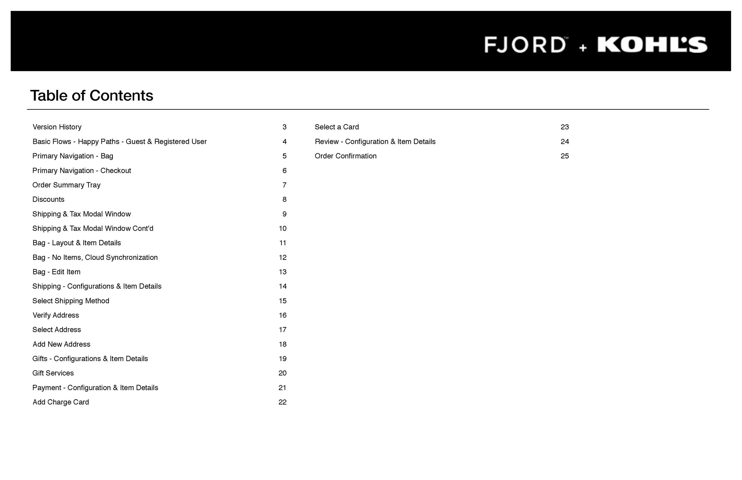
Here are the final wires I delivered for the checkout flow:
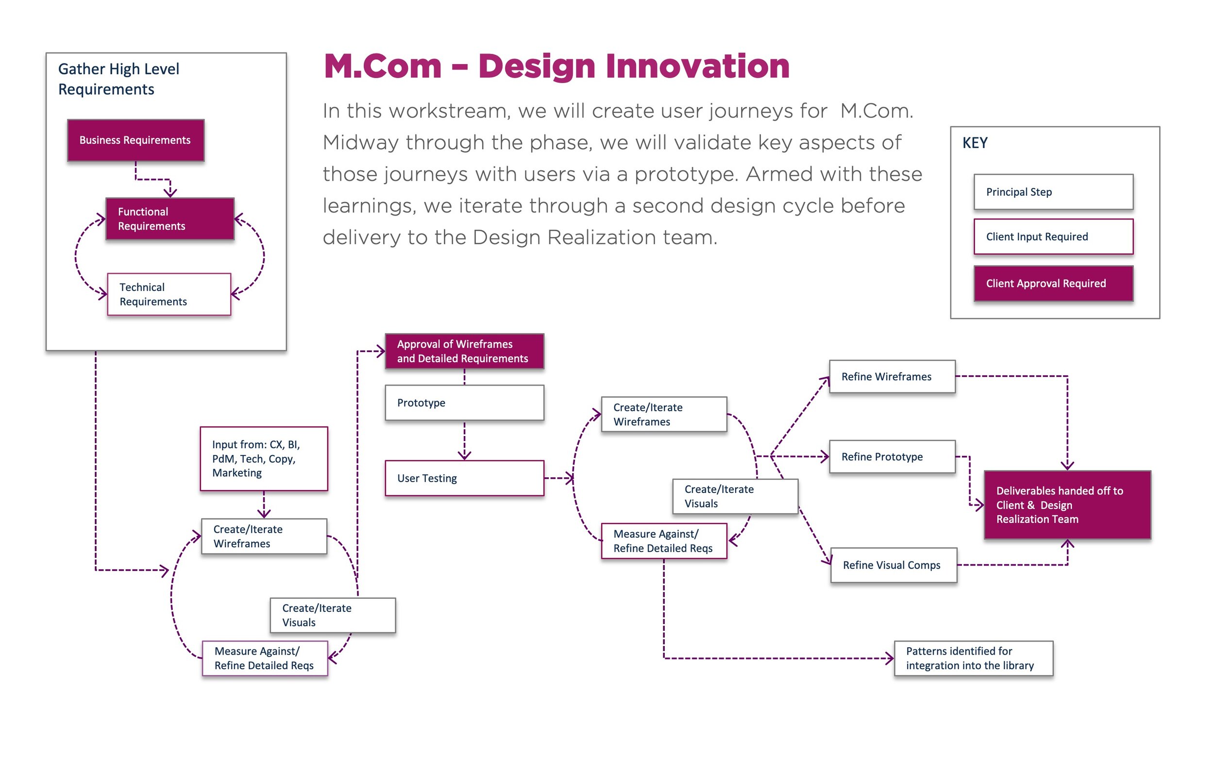
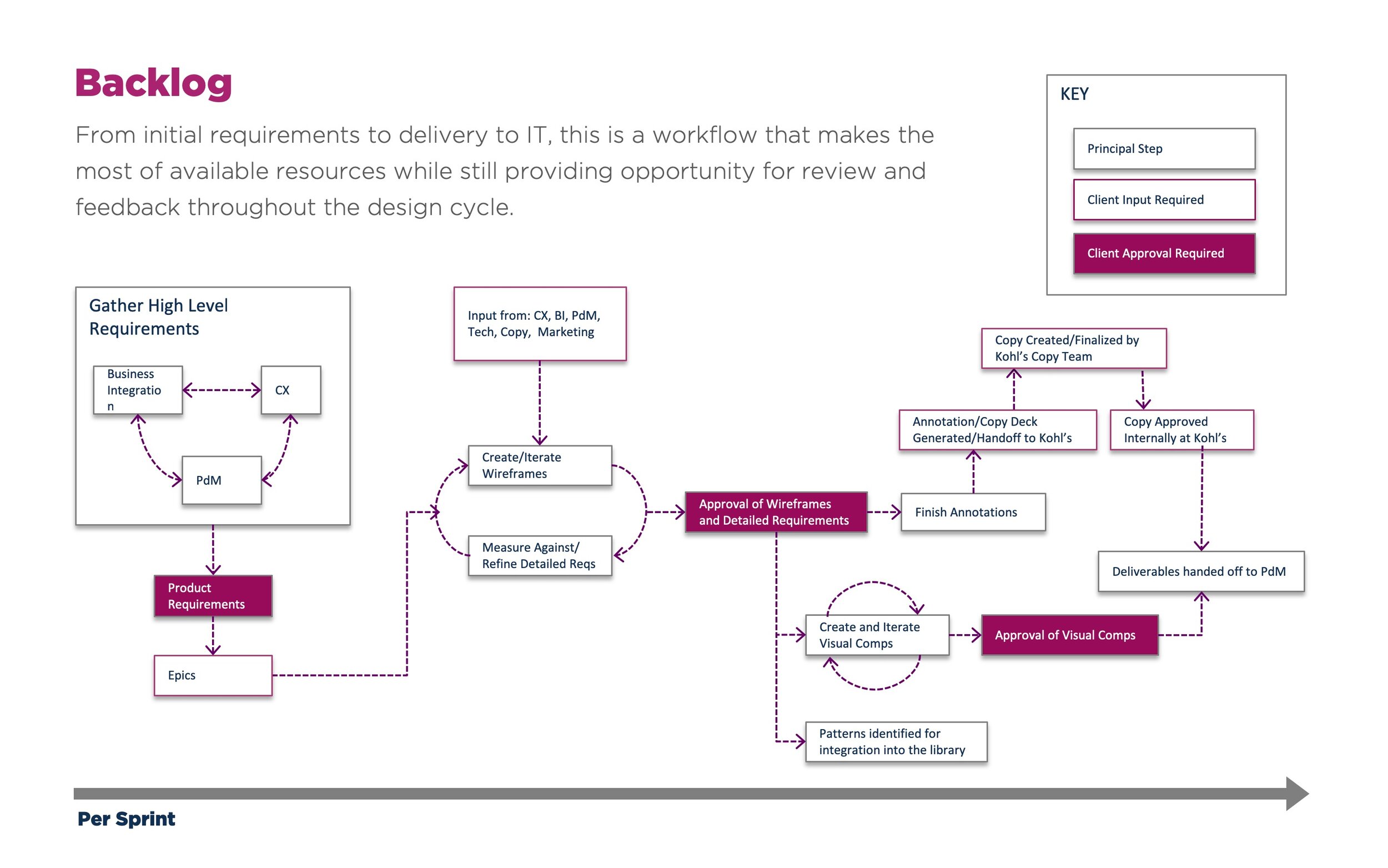
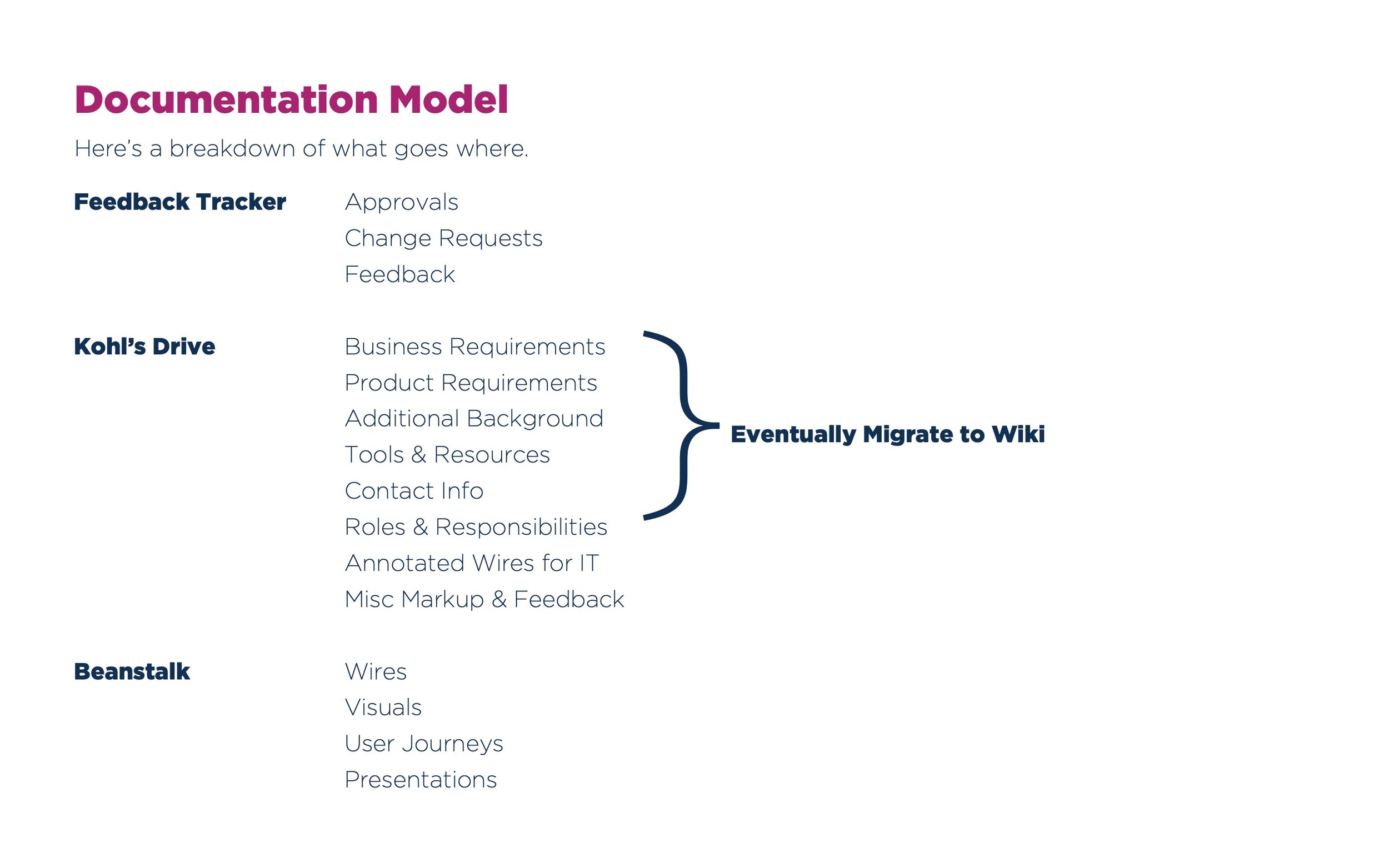
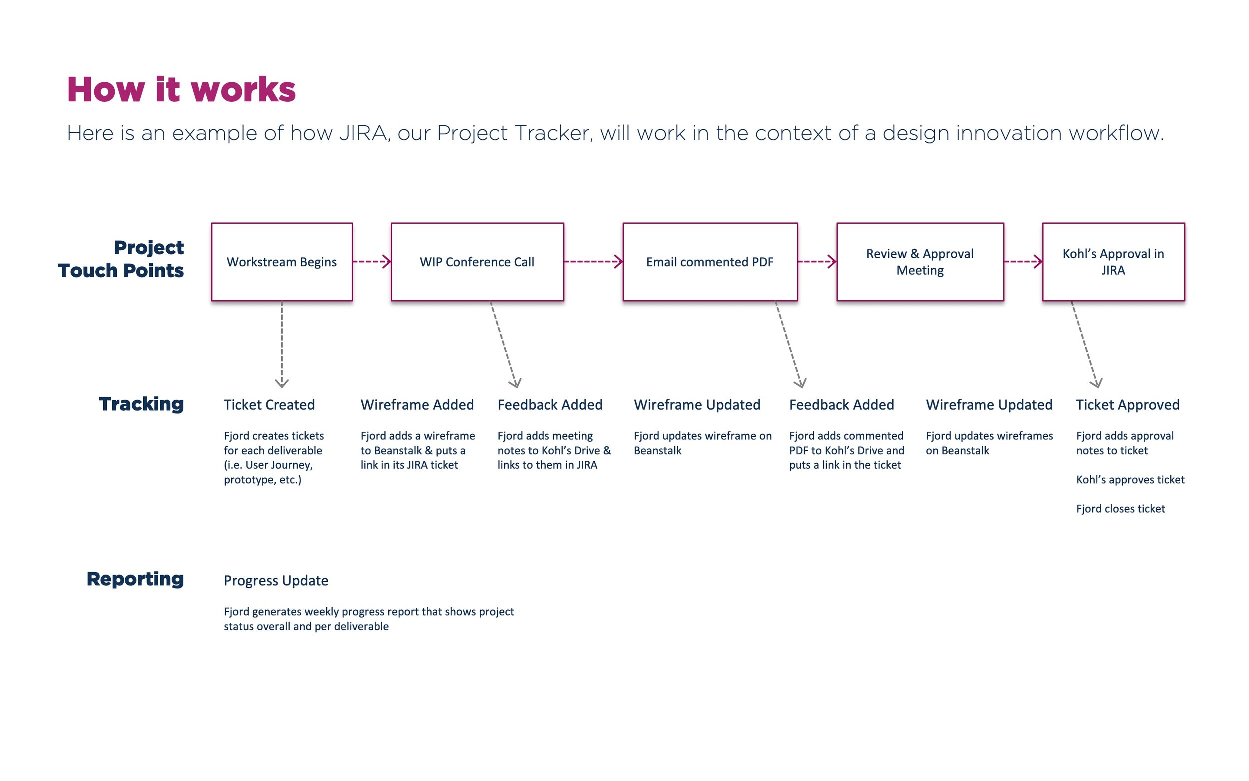
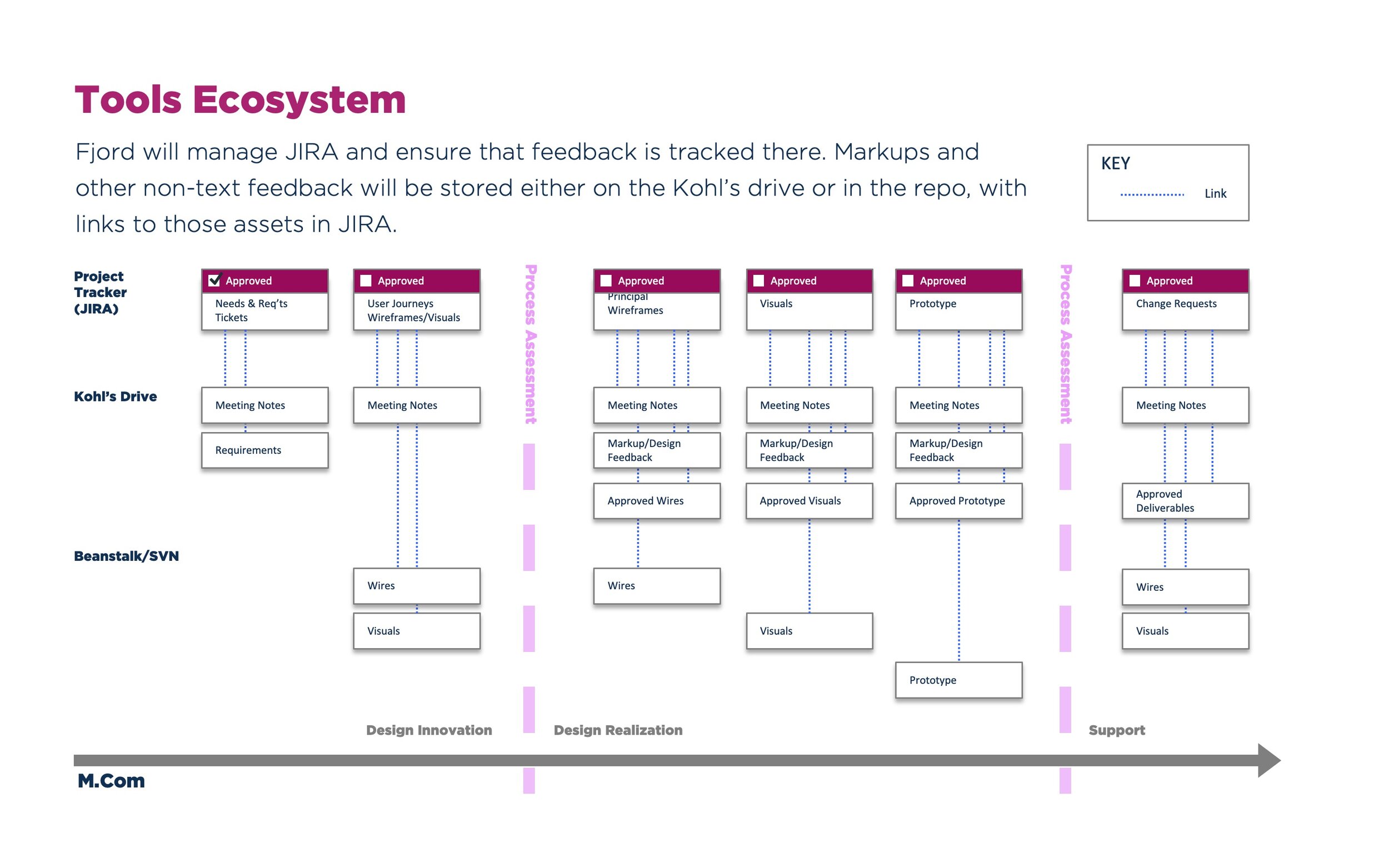
Here's the governance model I designed and put in place to coordinate production and approvals for detailed design of the visuals that followed from the wires:
Release
The month it was released, the app's downloads exceeded Uber's, according to Yahoo Finance. The app's user ratings on iOS are now at 4.8, compared to an aggregate pre-upgrade rating of 2.3.

